I can’t sit still. Whether it’s taking photos, making music, or building something - my happiness is directly linked to my productivity. So, you can imagine I have a lot of hobbies in which I spend most, if not, all of my free time doing. I constantly see these hobbies as skills I can add to my toolbelt, and they help me to be a better creative.
I’ve been trying to find a role at Shopify where I could utilize these other skills I have to create a better user experience. Unfortunately, I haven’t had much luck. A small portion is because the company is so big that we have a person who does motion, a person to do the development, a person to do the photography, etc. all embedded or accessible to each team. Don’t get me wrong, I’ve been able to stretch my role as a “designer” as much as I could in the past, but the projects have never been as all-encompassing as the launch of Inbox.
I joined the Messaging UX team mid-spring of this year, it’s a small team working on bringing a new product to market. Being the sole visual designer working on the marketing campaign meant that there was a lot of potential to be scrappy and have the freedom to go beyond the normal role of a designer.
Shopify Inbox is the combination of two previous products - Shopify Chat, and Ping. Ping was an app where you could manage conversations from a variety of places like Facebook Messenger, Apple Business Chat, or the chat window on your store. Shopify Chat was the chat window you could enable on your storefront so customers could start a conversation with you. Merging the two into one product was a beautiful solution to a confusing UX flow.
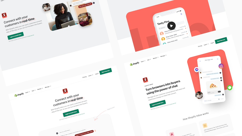 Early visual explorations for the Inbox brochure page.
Photography
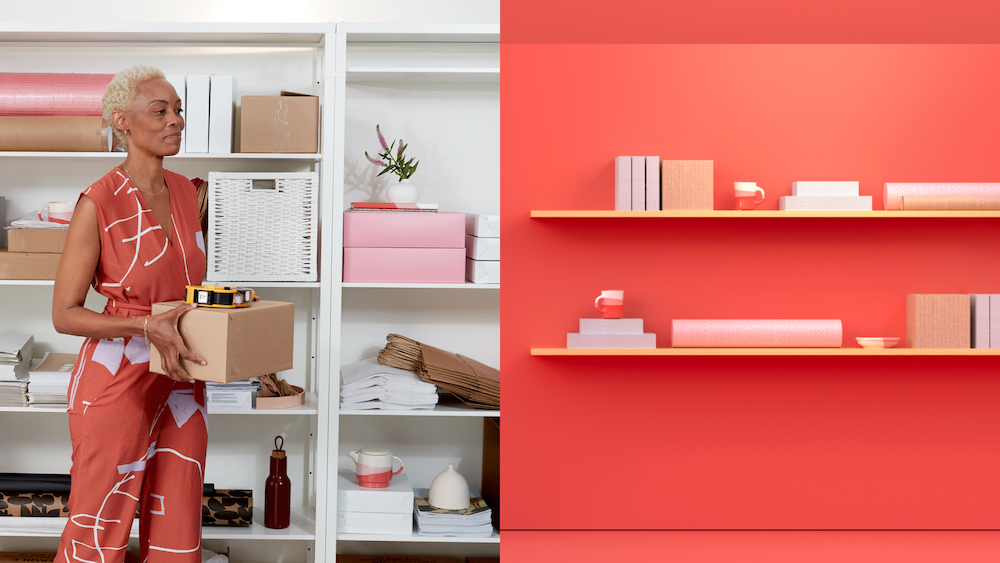
When we started diving into the work we got approval to put together a photoshoot so that we could curate original content for the brochure page and future marketing materials.
I’ve been doing photography as a hobby for about 6 years now, and I sell my landscape photographs as prints. I had a brief stint as an Instagram “influencer” in which brands would send me products to take photos of to post, and I even ventured out into doing photography for brands directly. It started feeling more like work and less of a hobby so I dialed it back and only shot content for myself.
Fast forward to this Inbox project, I was really excited to tap back into my experience with that to better collaborate and art direct the shoot. I got to work on building out a creative brief and art direction in which we could use to partner with a photographer/studio. Since Inbox is a conversational product I tried brainstorming how to showcase a conversation between a merchant and a buyer - but in a digital environment. I had an idea of having a buyer in their home environment, and a merchant in their back-office both sitting at a table that was almost identical so that it’d connect the two even though they were in different places and bring in this level of symmetry. I put together this fantastic sketch that everyone seemed to love.
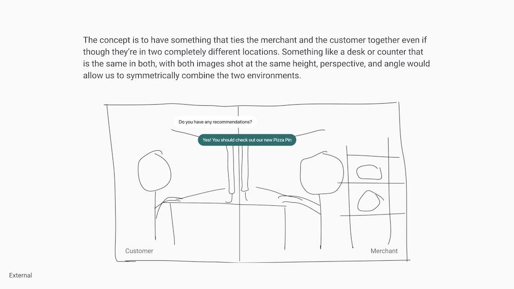 Very rough sketch to illustrate the idea of connecting two people through digital conversation.
I sent this over to Rémi Thériault, a photographer with whom we’ve worked in the past. He and his agency were on board for the task even with our incredibly short timelines. It was going to be a challenge to shoot in different locations but ensure that the camera stayed at the same distance, perspective, height, and angle to get that perfect symmetrical cut. We cast Kagiso and Nicolai to be the merchant and buyer respectively and chose a wardrobe that included colours from the Inbox palette. Our prop stylist Melissa had a big job to curate pieces that both fit the Shopify direction and some individual pieces that introduced a pop of Inbox red. The table was also a huge factor, and she went above and beyond to get the table that was the centerpiece of the shoot.
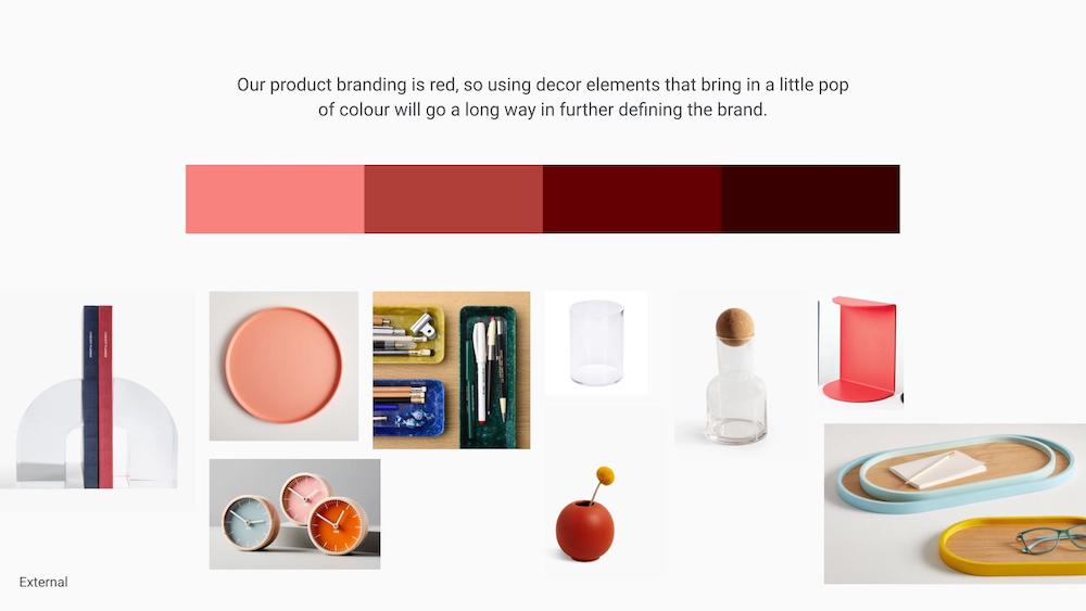 Inbox palette with examples of products that can add in a touch of colour.
Rémi, his team, and I worked hard at making sure the two shots (different days, different locations) matched each other perfectly, and when all was said and done, the table cut was perfect - but something felt off. Whether it was the locations not working together well, the merchant shelving not being visible directly, or the UI component that was overlaid on top not sitting well enough - it was just using too much of a cognitive lift to understand the message we were trying to communicate. I knew we had to pivot the hero moment.
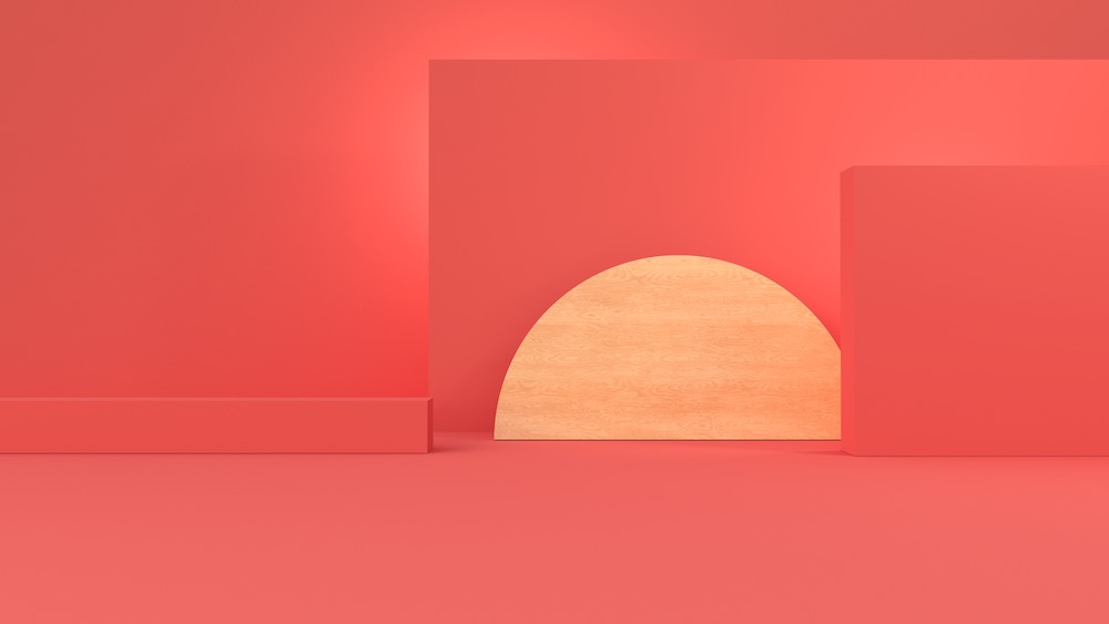
Pivoting ended up working out for the better. Taking inspiration from some other Shopify ads I’ve seen in the wild I decided to create a stylized 3D studio of sorts to bring some depth to the abstracted UI in the hero moment.
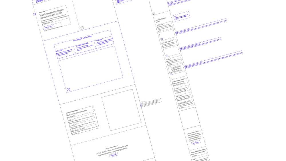 Inbox brochure page wireframes.
3D rendering
I’ve always had an interest in 3D rendering, and it’s actually how my career as a designer began. I used to create artwork for music artists that were primarily 3D renders, and that ended up landing me a job with the record label, Monstercat. Being able to combine that interest of mine with the work we were doing made a huge impact.
With the environments I created, we wanted to give one of the scenes more purpose, so I added some merchant shelves and crafted the products that sit on them to match the ones from the photoshoot. The small details went a long way in making everything feel cohesive and the environments ended up being a large part of the Inbox brand, with a few variations we could use in additional materials.
Motion design
Similar to the 3D render skills I had, I also used to do a lot of animation work for music releases. I’m pretty fluent in Adobe After Effects so I knew I could create some motion graphics to better communicate the product and its features. I feel like adding some motion gives better focus on what information you want your user to digest at a particular time or order, and gives you full control of the complete narrative.
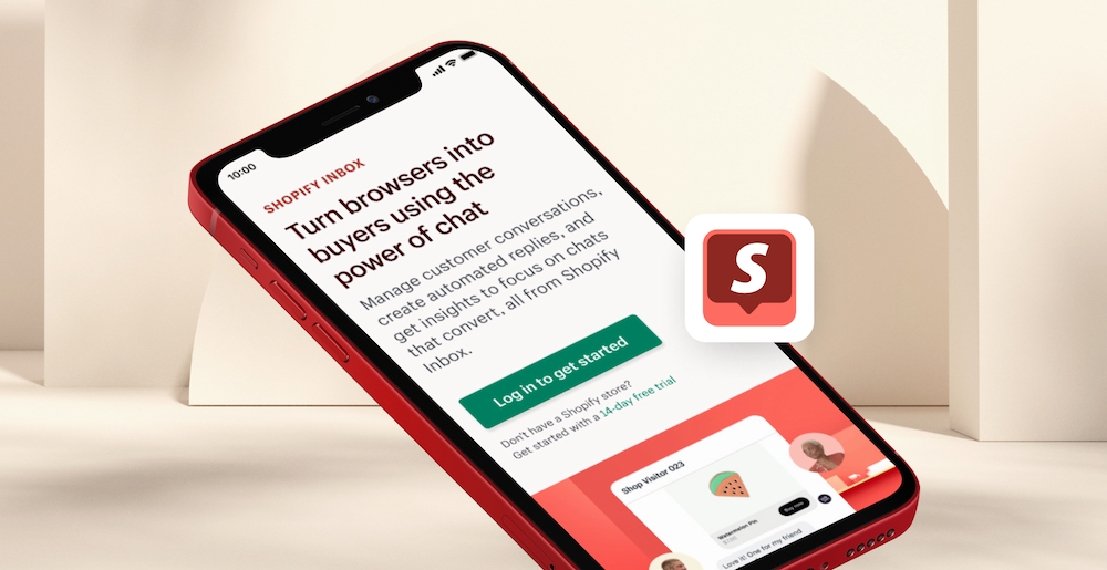
Turn browsers into buyers using the power of chat
With the hero animation, I really wanted to emphasize the aspect of this conversation that converts to a sale. Leading with the messages going back and forth to simulate a conversation in real-time, and adding in the cart action and a sprinkle of confetti to give that big success moment some flair.
Set it up in admin
For the ‘Setup’ animation I wanted to portray the customization in a way that made it feel virtually limitless. I wanted to show that no matter what your brand looks like, you can tailor the chat window to match. To do that, I designed 12 storefront mockups all following different trends and styles, and had them scroll through with the chat window matching the palette.
Chat anytime from anywhere
The ‘Chat anytime, anywhere’ animation was a little story of a merchant starting the conversation on their desktop, logging out, and then being able to continue the conversation on the go. It’s a little long-winded and requires a bit more cognitive lift to understand what’s happening, so I’ll be revisiting this in the future.
Knowing that we’d have these animated pieces, I suggested using those to build out a promo video for the launch as well. Shannon, the content designer, and I worked together on getting a storyboard drafted, and I immediately started thinking about the audio since music is crucial in building the right energy and flow. The timelines were tight so licensing a song would take too long, and since we were using original content for everything else I felt like using a royalty-free track wasn’t the right fit.
Music production
On the side, I make and release music under the artist names COVEO and Salété. With COVEO being more of my more melodic and euphoric sound, and Salété being for more of my dark and electronic-themed songs. I’ve been into music for as long as I can remember, growing up playing the piano and trumpet and then combining my passion for computers with music in the early 2010s.
Given this opportunity with Inbox, I asked the team to trust me and opted to make the music myself so we could create the exact tone we wanted to convey. I put together two directions, one had more funk, and the other tied into the campaign wrapper of ‘Power’. It was a no-brainer to go with the latter.
Shopify Inbox - Funk v1
Shopify Inbox - Power v1
The video came together quite quickly. We had the timing cuts, and initial text animations right away, I included the 3D environments I created, and I even shot some footage during the photoshoot to further connect the creative. It all came together as a 45 second video to build some hype around the product, and the power it has to turn browsers into buyers.
Outcome
I didn’t do this campaign alone, I was joined by the super talented Shannon Murphy who led the campaign, Annie Berrones who managed the project, and the whole product team at our backs. You’ll see the incredible work that Shannon did throughout the brochure page and comms, and she made my job so easy to put it all together. This product launch wouldn’t have been possible without the team, the wonderful people who helped give feedback, and finally the trust from my peers who supported me in going above and beyond. I’m glad that after all this time, I have found a role that is deeply, truly, for me.
Credits
Thanks to everyone who helped make this campaign what it is.