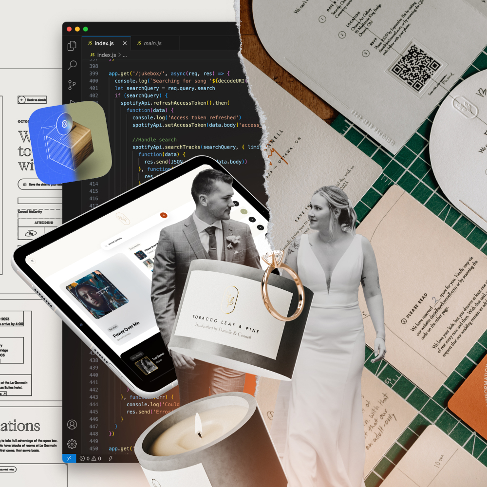
On a misty Saturday afternoon in October, my wife and I said our vows in front of 120 of our closest friends and family. I could write a sappy love story about Danielle and me, like this video I made after proposing to her. Instead, I want to focus on what we built for the wedding and how I opted to create as much as possible by ourselves, probably more than necessary.
It started early on. We got engaged in March of 2022, and within the following weeks, we had almost everything booked and planned. We managed to get one of the last Saturdays of 2023 at the Ottawa Art Gallery, which was a rude awakening for me as I was blissfully unaware of the chaos of the wedding industry. Shortly after everything was booked, it was time to get to work creating the wedding of our dreams.
Branding
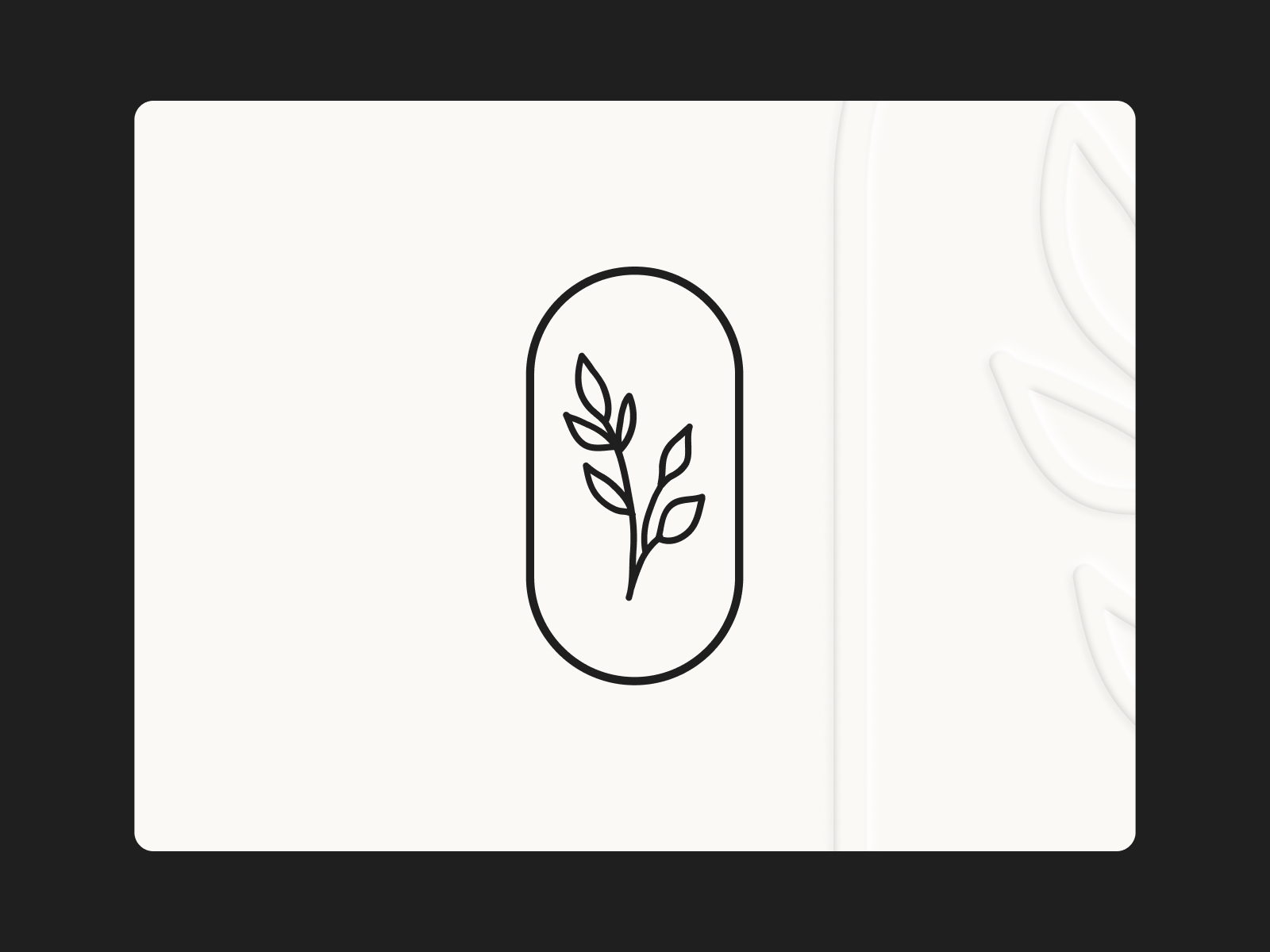
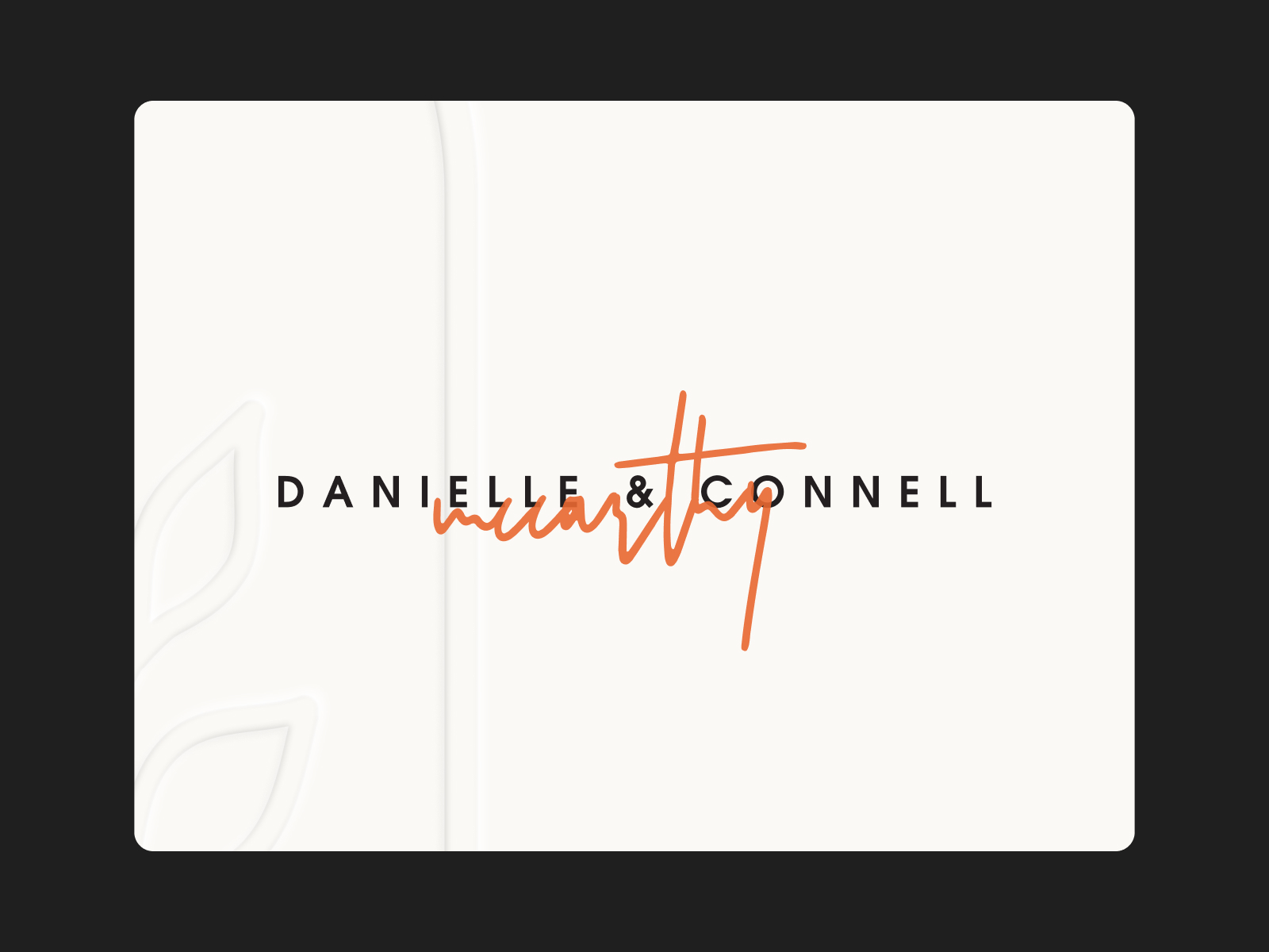
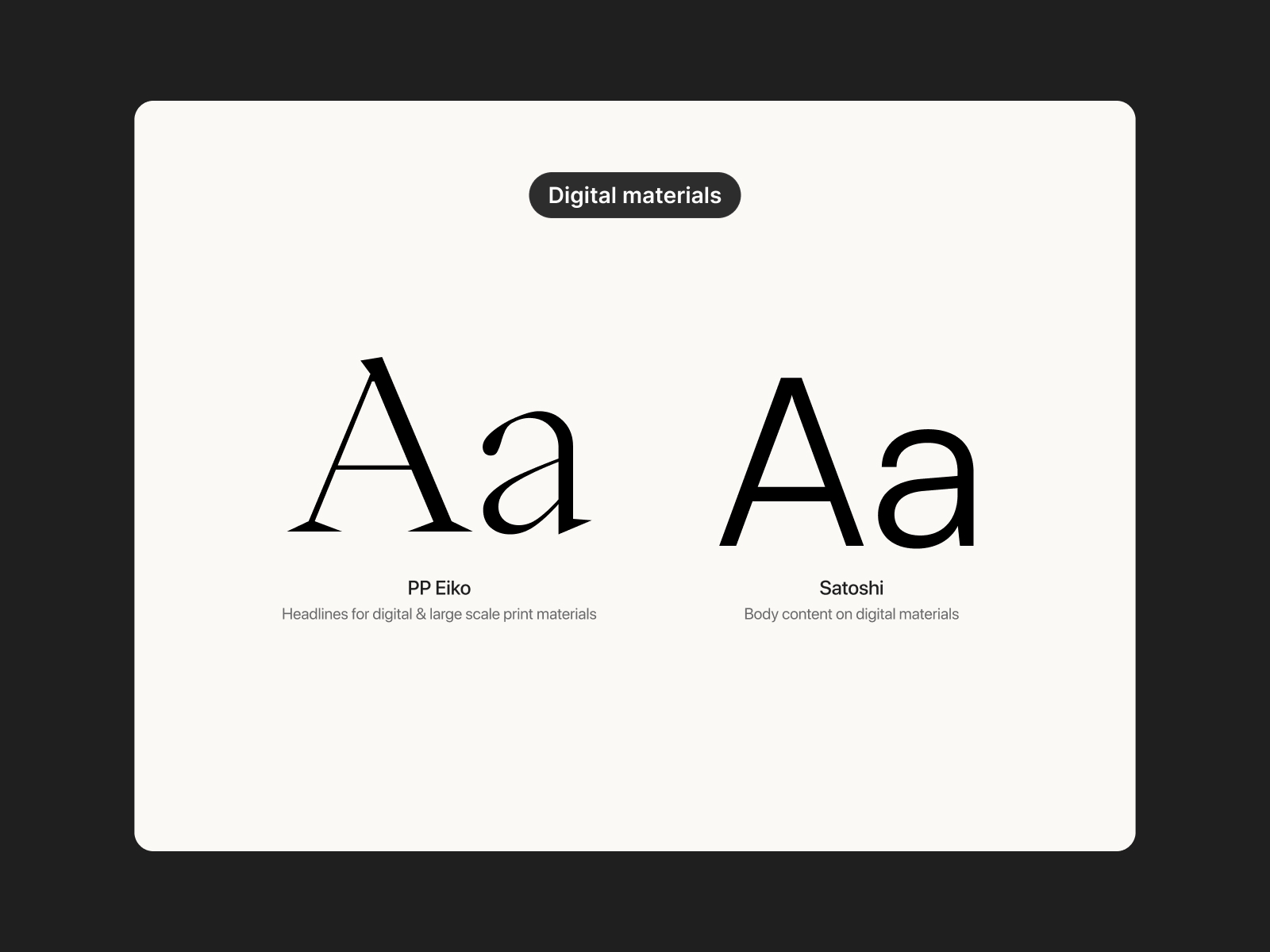
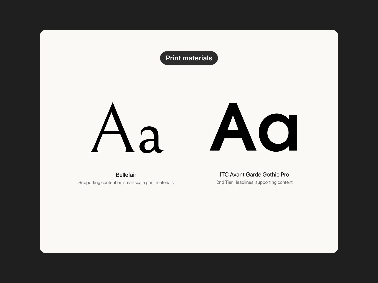
The first thing to figure out was the general aesthetic and branding for the wedding. It’s a bit unnecessary, but this is my area of expertise, so I wanted to go all out. I started with a graphic device to act as a ‘Logo’ for the event, chose typefaces for the typography, and defined a colour palette so that all the materials felt consistent and cohesive.
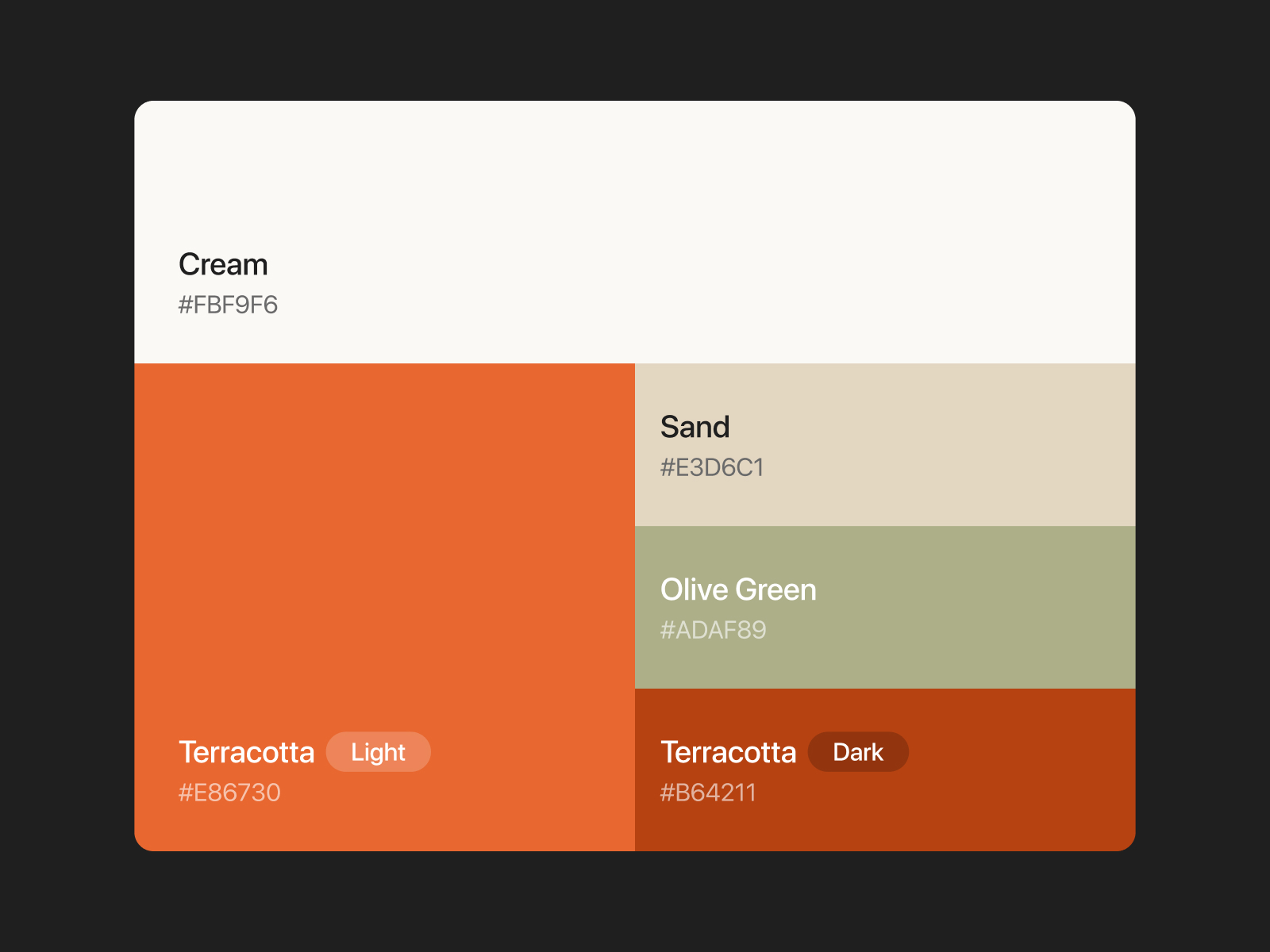
Since our wedding was in the fall, we opted to keep the palette in line with a warm autumn tonal range. Leading with cream as the primary colour, some warm terracotta paired with a desaturated olive green was a nice way to keep it minimal and add a touch of colour.
Using four font families is a bit much for a brand like this, but there were different needs for digital materials vs. small-scale print materials like the save-the-date, RSVP invitation, and menu. Mainly though, I just couldn’t make up my mind, so I chose all of them.
Stationery
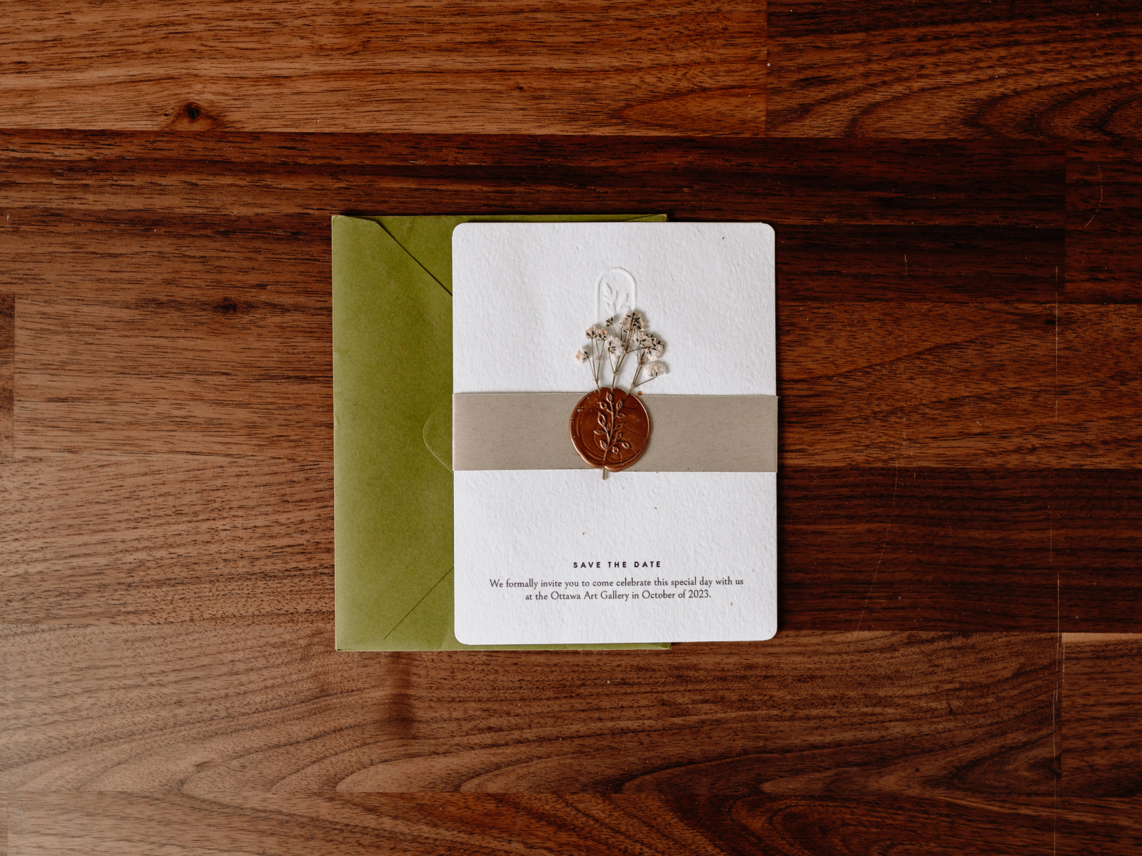
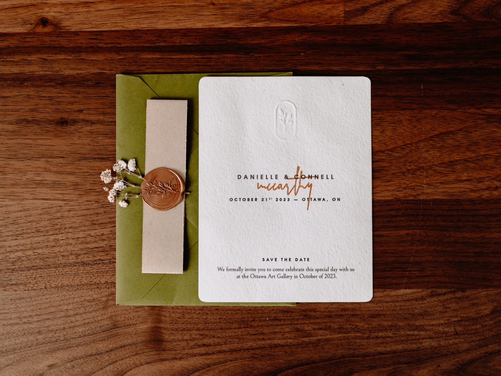
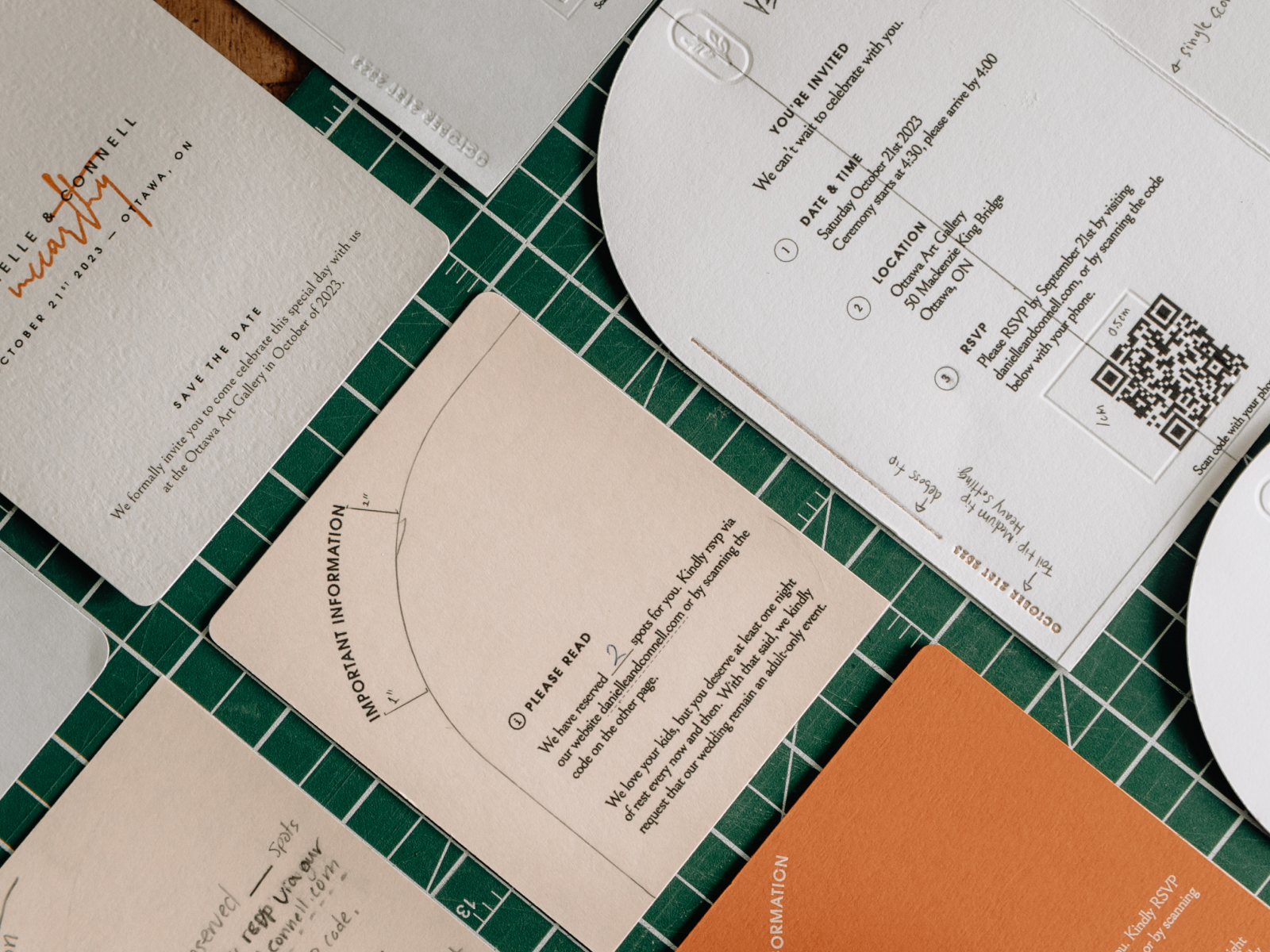
With our venue, website domain, and vendors booked for the day, we needed to send something out to our guests to let them know they’d be invited and to keep their calendars open. We started assembling the save-the-date mailer in late Summer 2022 to mail them out for the 1-year mark in October.
We went to a paper shop and picked out a nice cardstock with a subtle texture and a slightly off-white colour. I kept the design simple, and to minimize the amount of paper waste, I designed 4 to fit perfectly on standard letter-sized paper. I wanted to make them feel customized in a way, so I ordered a custom embosser of the logo, a rounded corner cutter, and a custom stamp for the mixed media effect for our names. I liked the structured type of our names and the organic contrast that the hand-stamped ‘McCarthy’ gave with it.
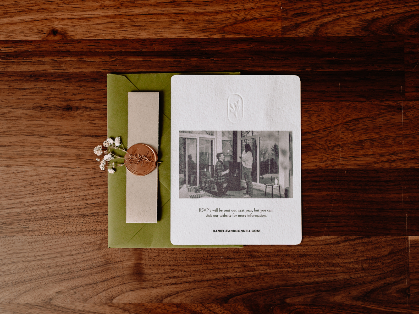
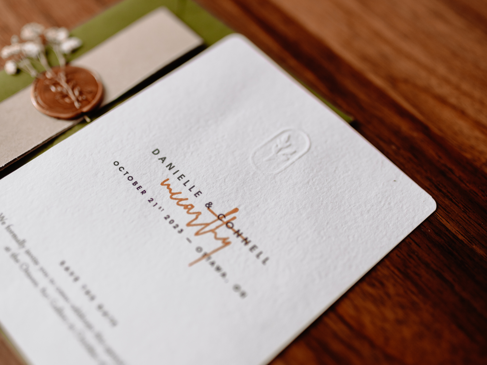
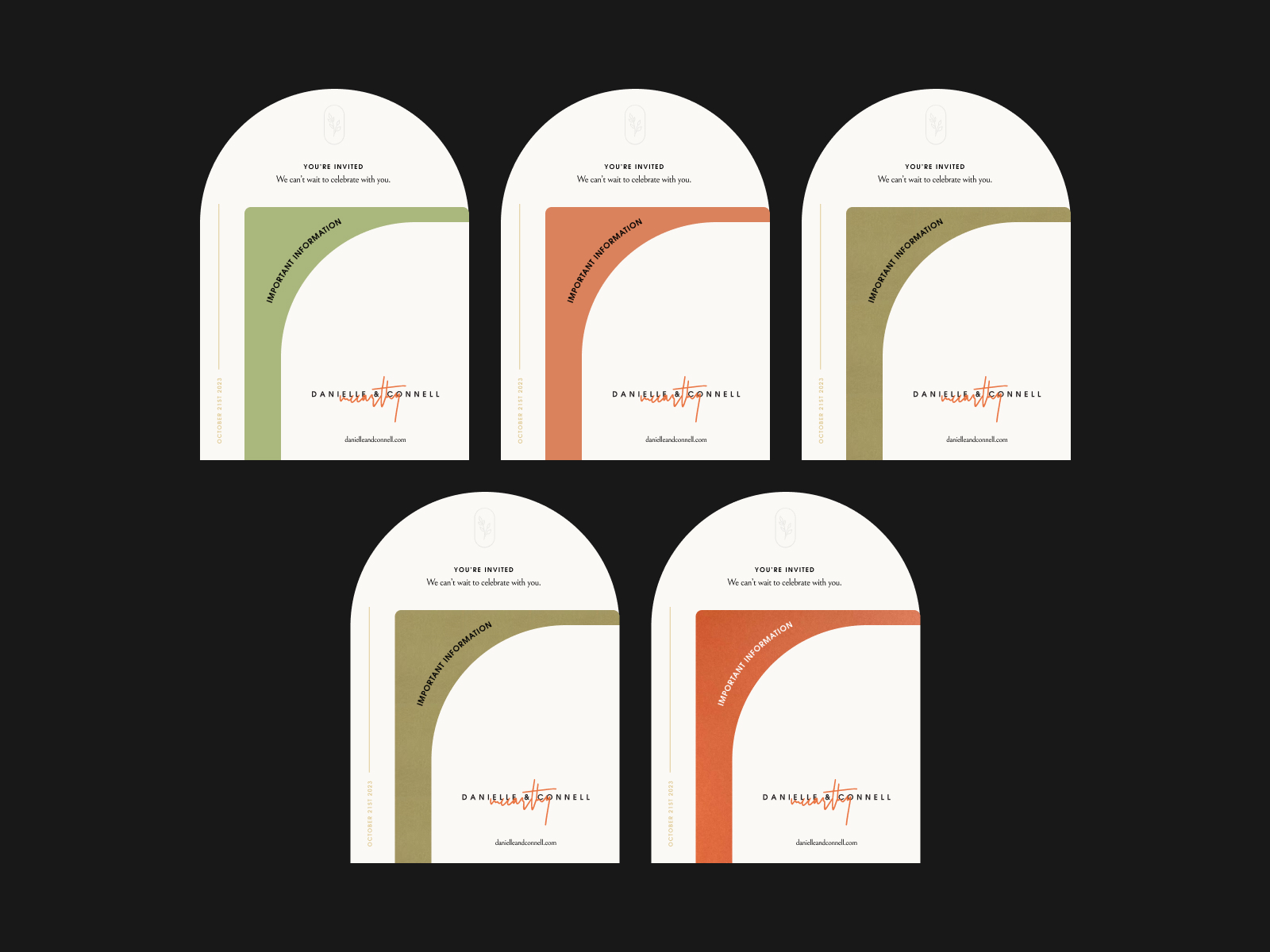
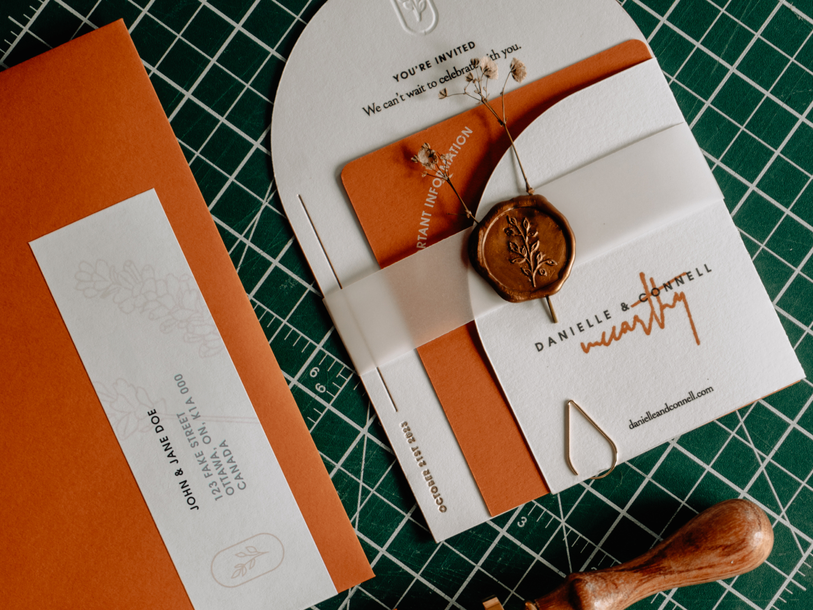
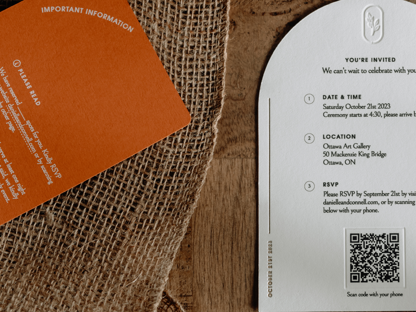
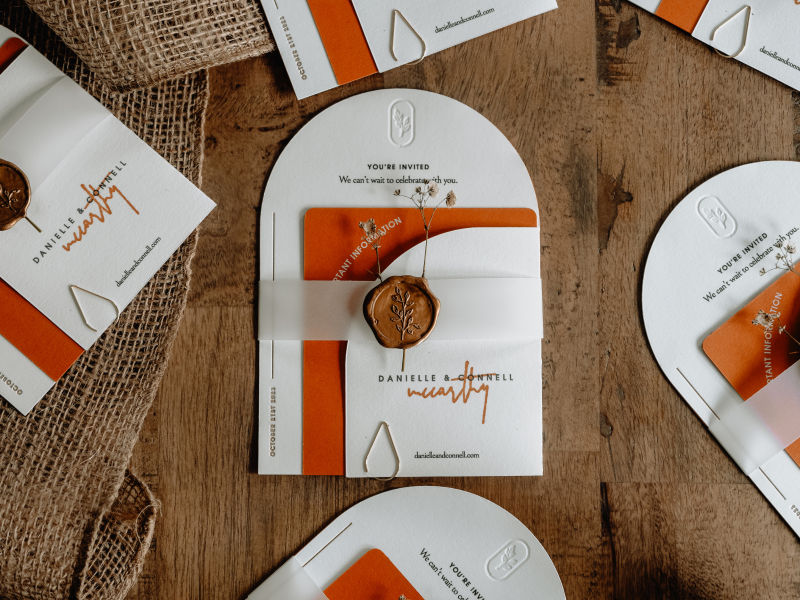
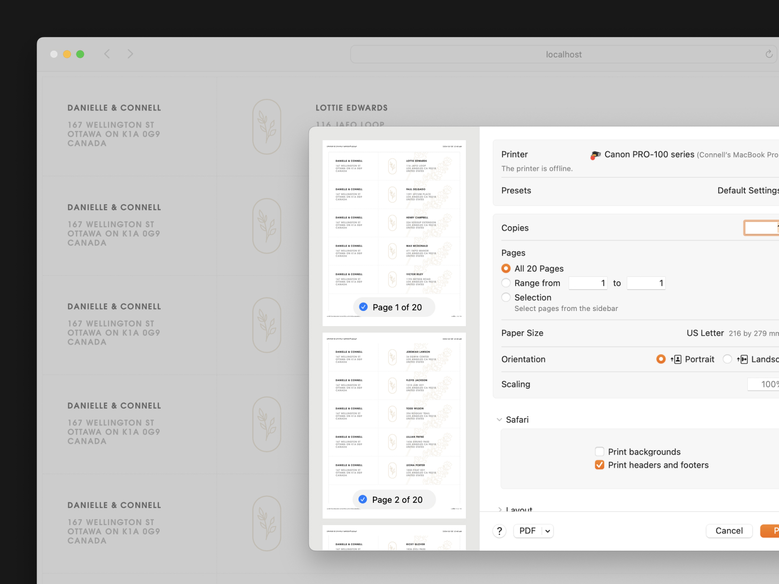
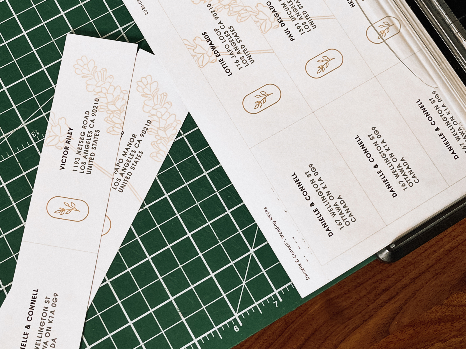
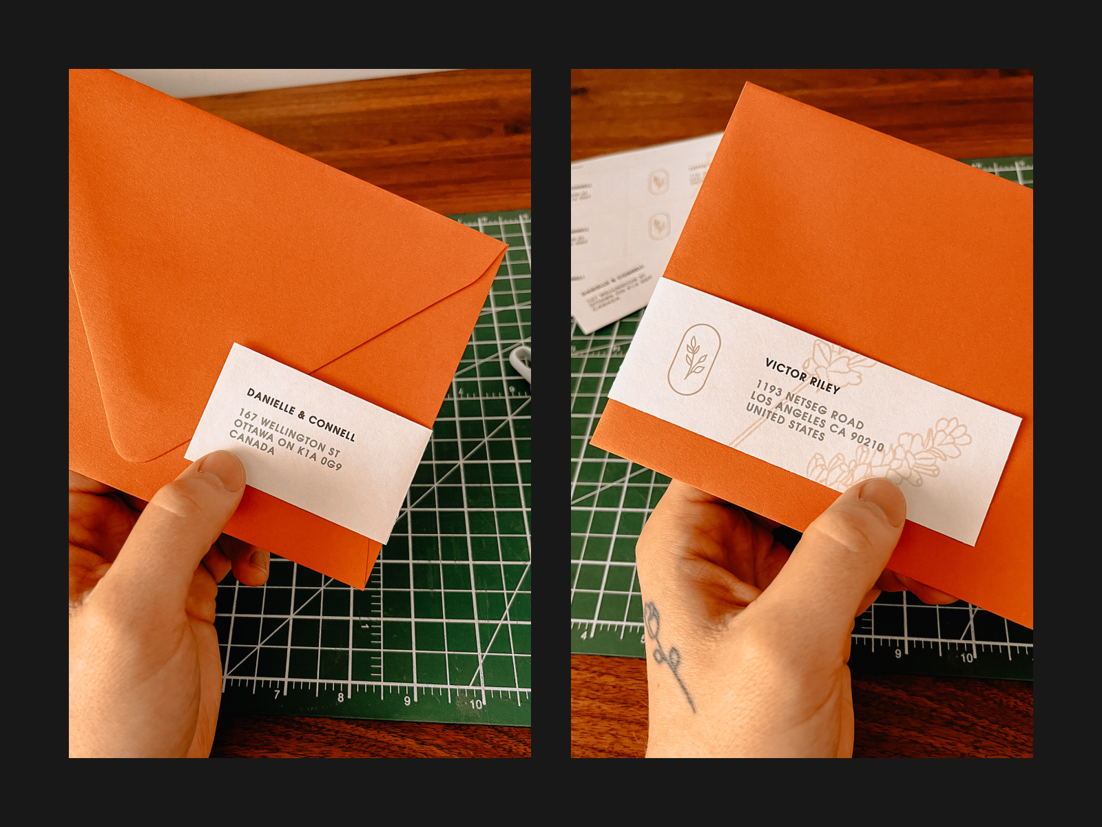
After the save-the-date, I moved on to planning the RSVP mailout. I knew I wanted to do something more intricate, like a half-moon cut on the top of the RSVP and an information card inserted between pieces. A few paper options from the Cardstock Warehouse fell within our palette, so I mocked them all to see which felt better. We picked Rust and used a Ghost Toner cartridge to print white ink on them.
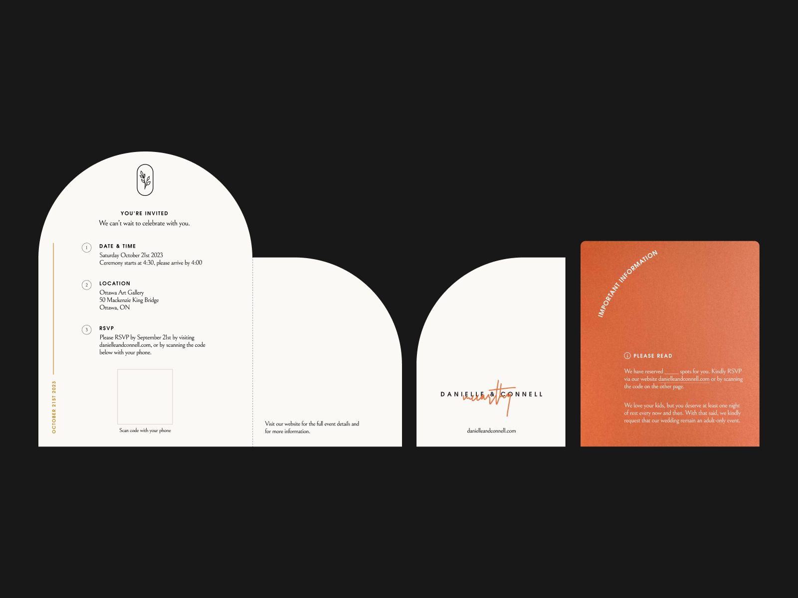
Manufacturing the RSVP itself was a significant learning process. I bought a Cricut Maker 3 to make custom cuts like the half-moon top. It allowed us to add more customization, such as the scoring line for the front flap, debossing both the logo on the top and a box around the QR code, and even the opportunity for a gold foil edge piece. It took a lot of prototyping, but I finally produced almost 80 invites on premium heavy-weight cotton cardstock from LCI Paper. The result was a high-quality invite that looked and felt like a professional made it.
Weirdly enough, one of the things that got me excited was the envelope labels. Instead of having a very large Illustrator document with all the labels for 80 envelopes, I built a script that pulled the information from a CSV and generated a printable PDF on standard letter-sized label paper. I used a few CSS parameters to optimize the layout for printing and a simple for loop in Liquid to render the labels with minimal effort.
var list = []
fs.createReadStream('_data/invites.csv')
  .pipe(csvParser())
  .on('data', function(data){
    try {
      let item = {
        name: data.MAIL_NAME,
        address: data.ADDRESS
      }
      list.push(item)
    }
    catch(err) {
      throw(err)
    }
  })
  .on('end',function(){
    res.render('labels', {
      content: content,
      labels: list
    })
  })
Javascript function for all the invite data
@media print {
    @page {
        size: A4;
        size: portrait;
        margin: 0.5cm;
    }
    li {
      page-break-inside: avoid;
    }
}
CSS for print format and sizing
{% for item in labels %}
    <li>
      <div class="from">
        <p class="name">{{ content.wedding.names }}</p>
        <p class="address">{{ content.wedding.address | replace: '\n', '<br>' }}</p>
      </div>
      <div class="icon">
        {% include 'partials/icons/logo.liquid' %}
      </div>
      <div class="to">
        <p class="name">{{ item.name }}</p>
        <p class="address">{{ item.address | replace: '\n', '<br>'  }}</p>
      </div>
      <img class="image" src="/assets/florals/lilac.png">
    </li>
{% endfor %}
Liquid loop for each invite item
Website
For the website I looked into using pre-existing services like The Knot or Say.ido, but I wasn’t happy with the amount of customization or templates that they offered. Obviously, the next rational decision would be to build it all out from scratch. Fair warning: it’s about to get a little nerdy, so if you came for the pretty pictures, I’d skip forward a bit.
When I started planning the tech stack, I wanted to keep it lightweight and quick to get up and running. My go-to stack leading up to this was a Node.js Express app using liquid.js as the frontend framework, so I went with what I knew. I was pulling live data from a database with this website, meaning I needed a dedicated server instead of a static service like Netlify. I dove into the world of Amazon’s AWS services and concluded that the Elastic Beanstalk environment was the best for my site. I didn’t realize how complicated AWS services can be, but I’m so glad I stuck it out and kept figuring out all the required services like Code Pipeline, Route 53, Certificate Manager, WAF & Shield, and Key Management Service.
The first iteration of the page was a simple informational lander for people to navigate to when the save-the-date got mailed out. I started with a very low-fidelity wireframe to get an idea of content structure and hierarchy. With that figured out, I worked on adding the branding elements I had already finished earlier. I kept it very minimal and clean, which allowed me to dedicate more to some moments of delight, like the ‘McCarthy’ being written on page load, some interactive photo moments in our story, and a cool Instagram story inspired storybook of some photos of Dani and I.
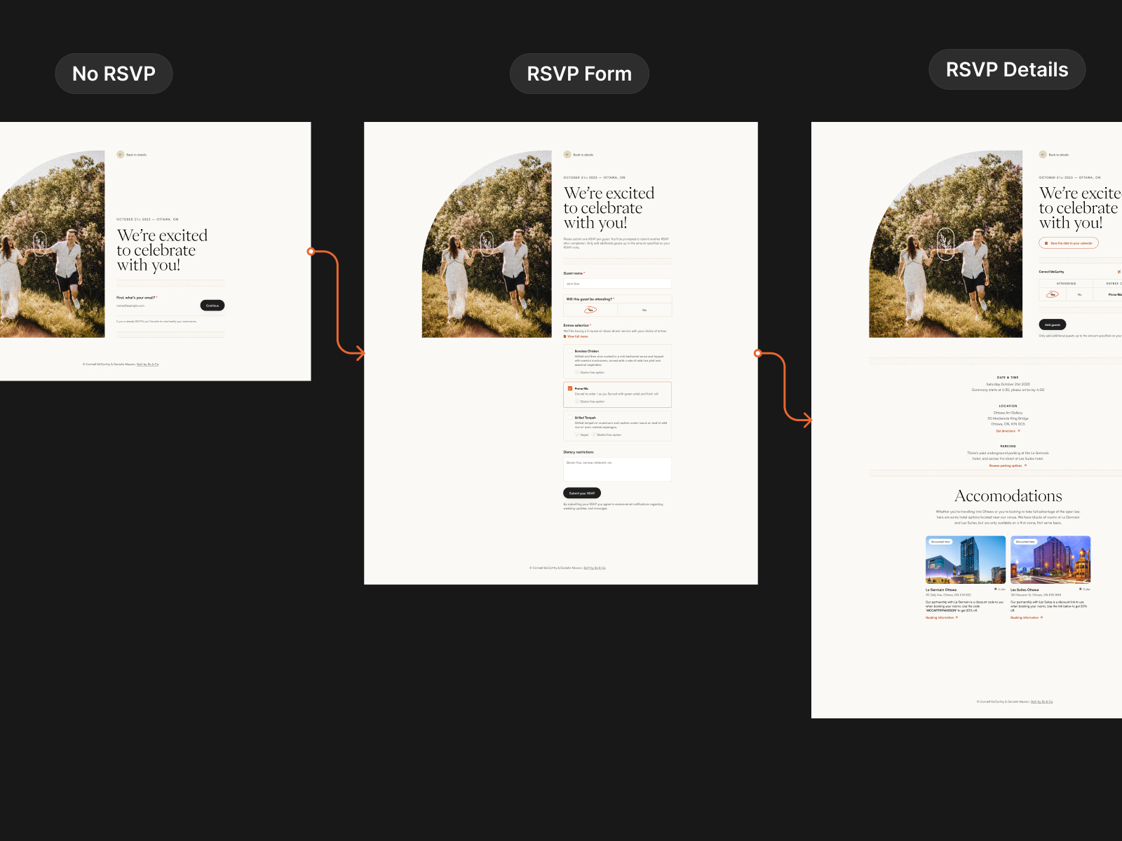
After a few months of focusing on other things for the wedding, the proper RSVP invites needed to go out. Again, I was thinking about using a pre-existing service, but unfortunately, all the ones I looked at didn’t have an API I could tap into for a cohesive experience. I returned to the drawing board on how to make our RSVP system from scratch. Dani and I spent a good amount of time journey-mapping the experience for our users from the mailed RSVP all the way to surfacing more relevant information.
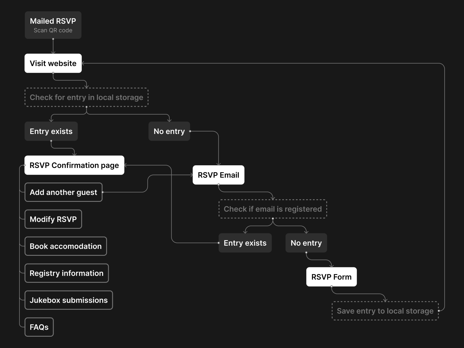
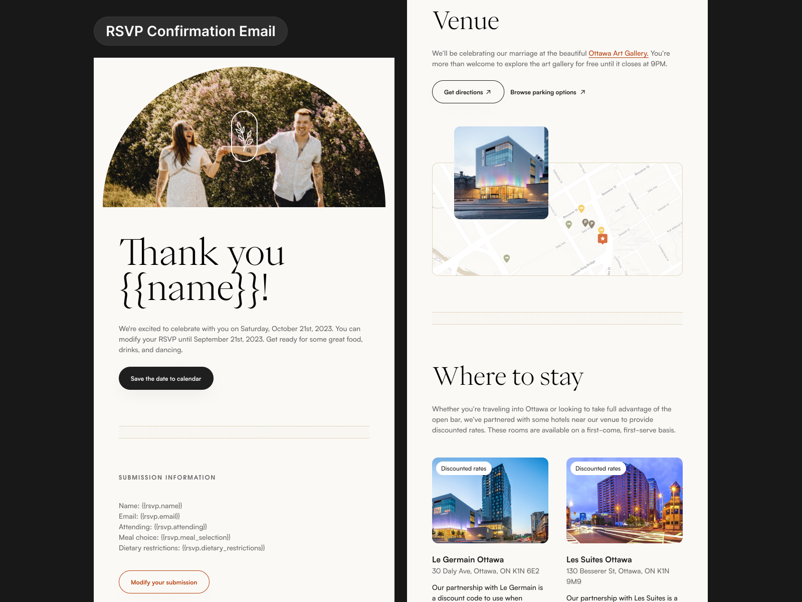
Building out an online RSVP system meant that I could add features to check in on your reservation and modify your reservation up until a cutoff date. Every wedding I’ve been to, somehow, between RSVP’ing and the actual day of, I forget what meals I’ve chosen. I wanted to solve that with this system. Another benefit to building our own system is that it allowed us to serve follow-up information, like accommodation discounts and registry information, at specific points in the user journey.
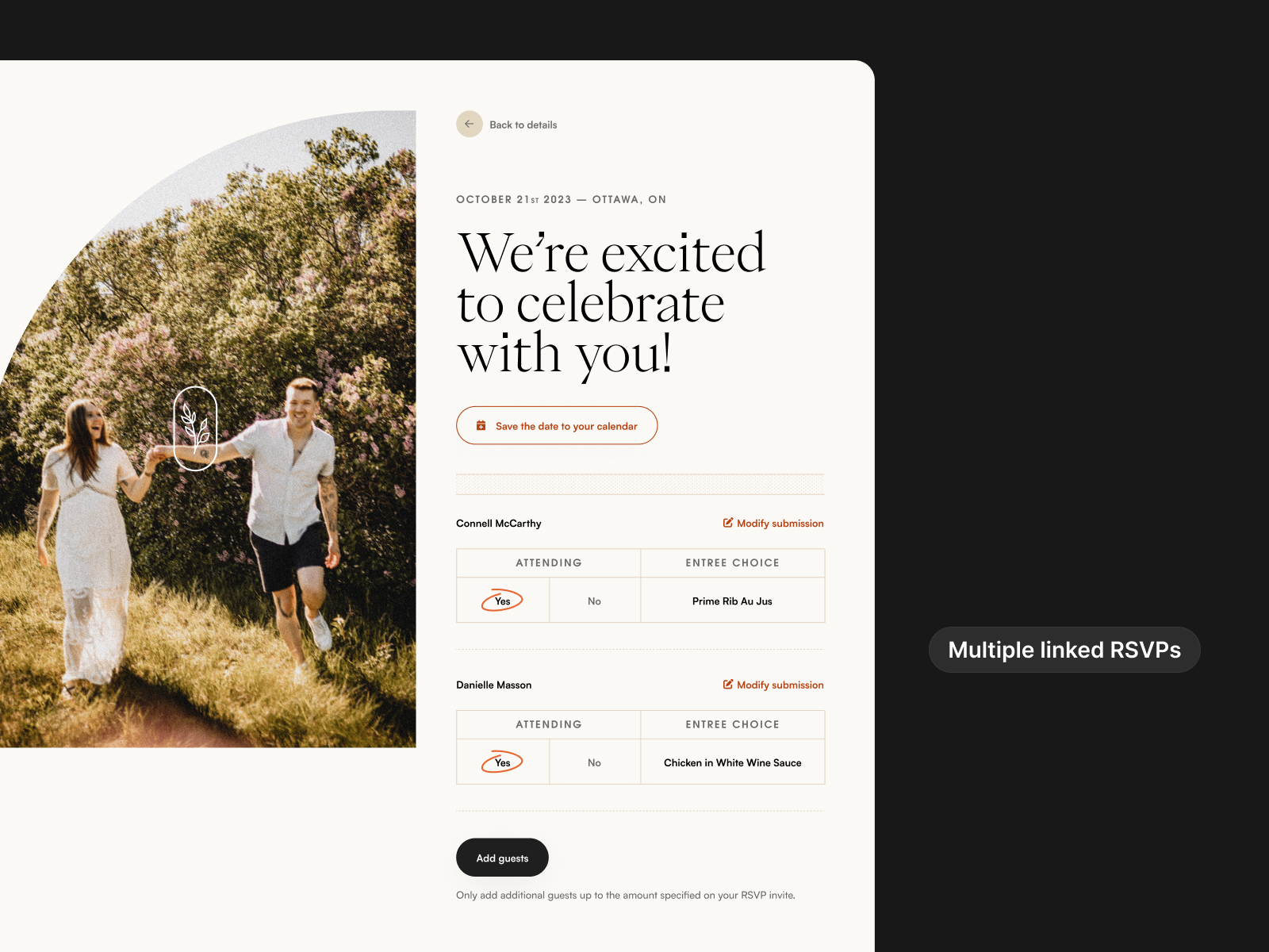
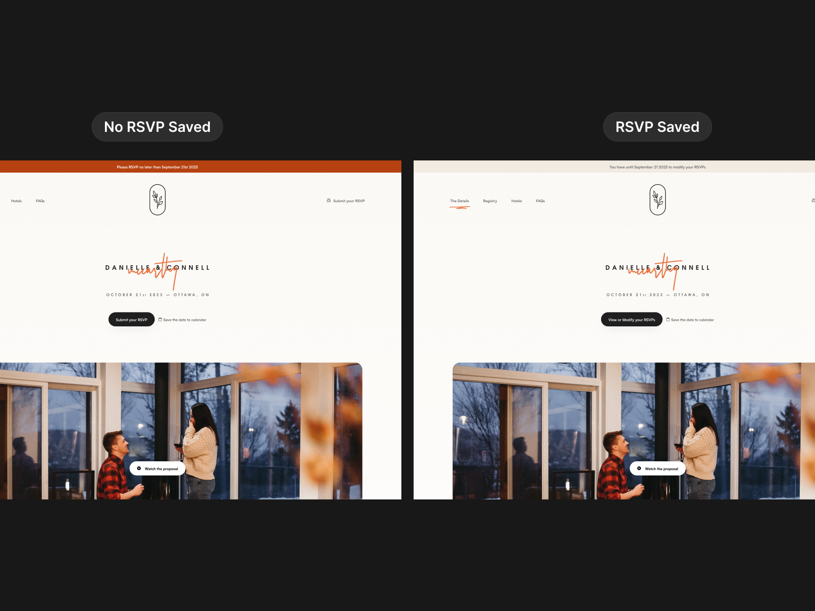
I set up a simple database to keep a record of the submissions and utilized unique identifiers for each RSVP group so multiple submissions could be paired together (i.e., spouses, family members, etc.) and that RSVP group would be accessible by a unique link. The link was emailed out upon submission of the form using the Sendgrid API and dynamic templates, and the reservation was saved to their browser, so anytime they came to the site, they didn’t need to re-enter their email to get their reservation information. It also allowed for the display of dynamic content on the homepage, such as the announcement banner and buttons that told them to either submit or modify their RSVP.
It was a great exercise for doing more backend development and designing a user experience from all touchpoints. I tried to make everything as efficient as possible and automate as much as I could.
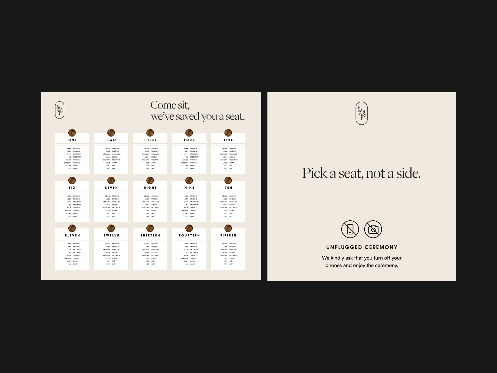
Signage
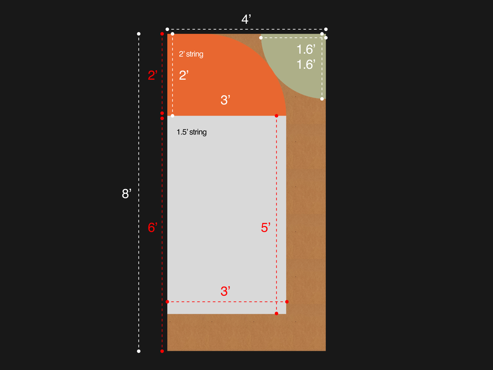
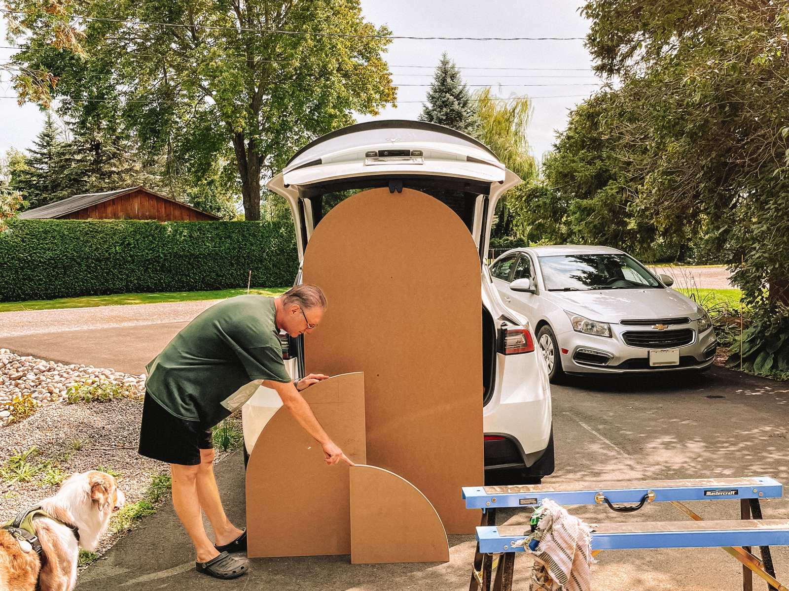
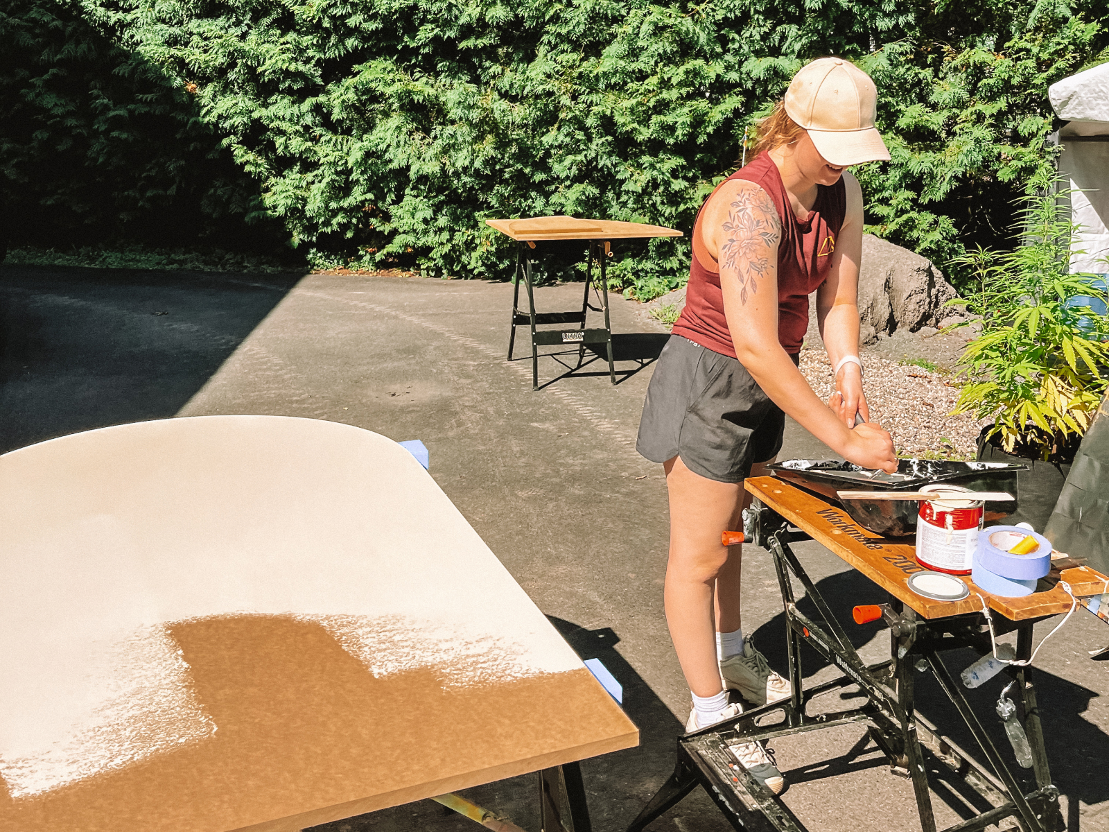
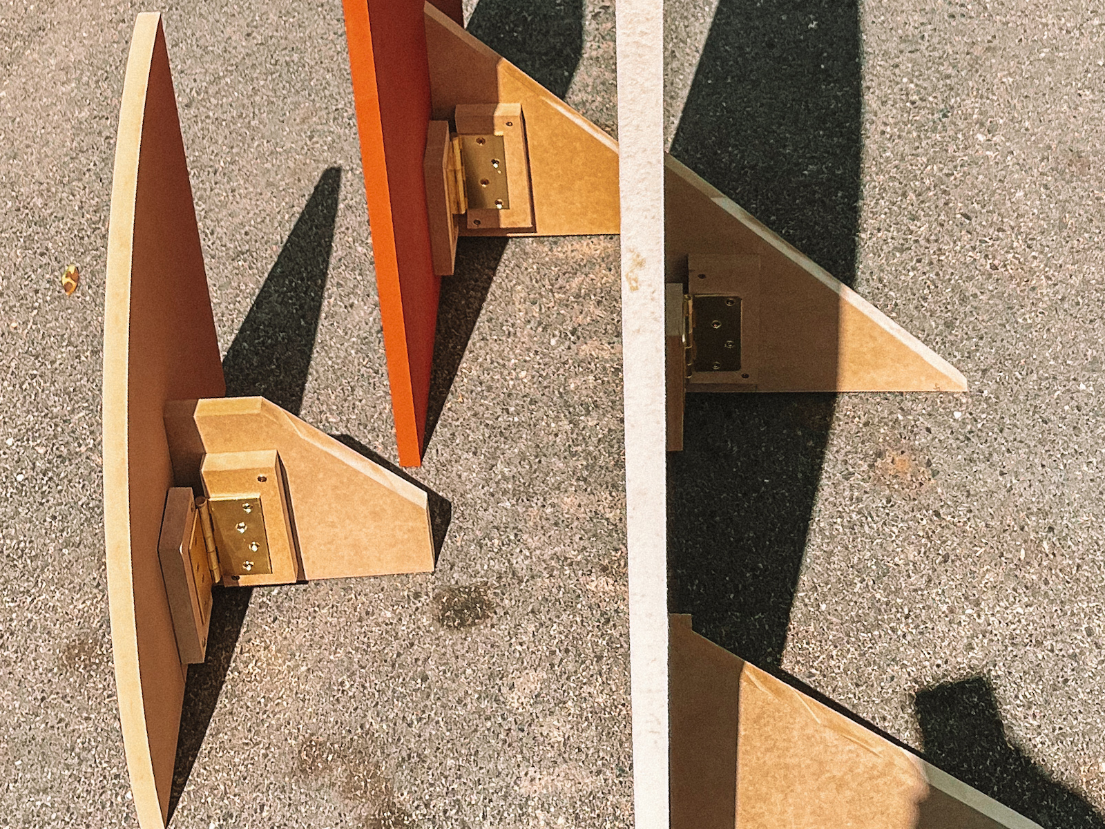
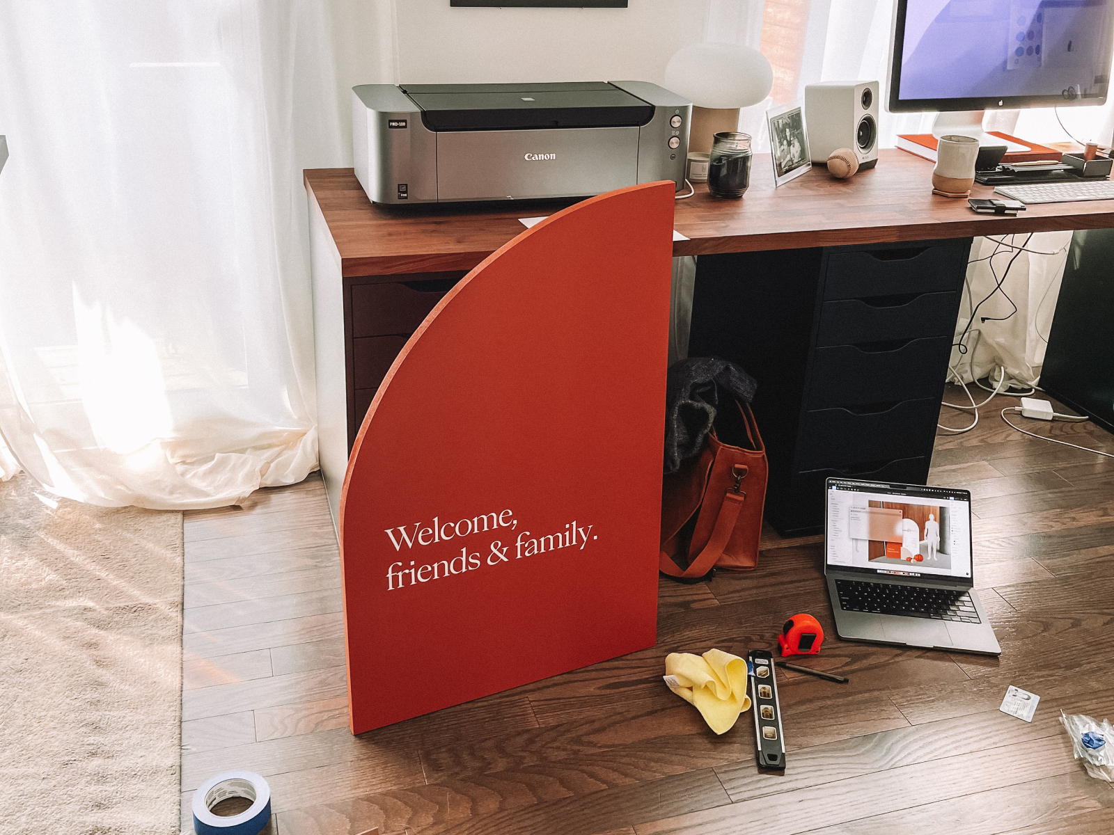
Getting out of the digital realm, we knew there were going to be a few pieces of signage we’d build out ourselves. One of those pieces was an important full-size welcome sign that was branded to match the invites and the rest of the materials. Dani planned out this build herself after I put together the scale mockup. We figured out how to cut the pieces out of a singular 8’x4’ sheet of MDF and got to work. Within a day, the pieces were cut and sanded down in the shape we needed, and we painted the first couple of coats. After the paint had dried completely, Dani’s dad and I made a few collapsable feet on the backs so they could stand and be transported easily. I brought them back to our house and used the Cricut machine to cut out the vinyl lettering to place on the front. I wanted a mixed media effect similar to the RSVP, so I cut a stencil for the logo on the top and the ‘McCarthy’ and hand-painted them both. They turned out so much better than I thought.
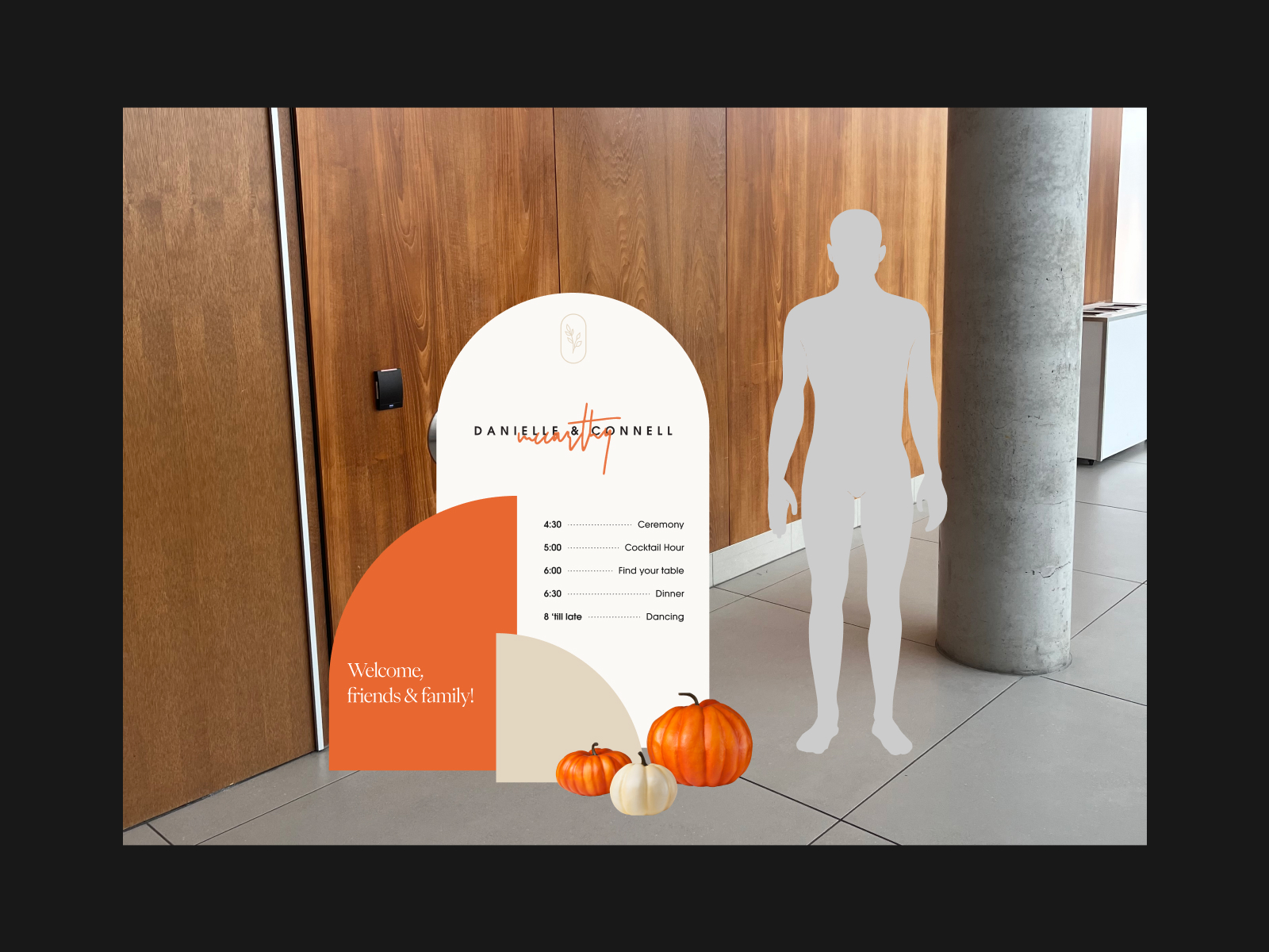
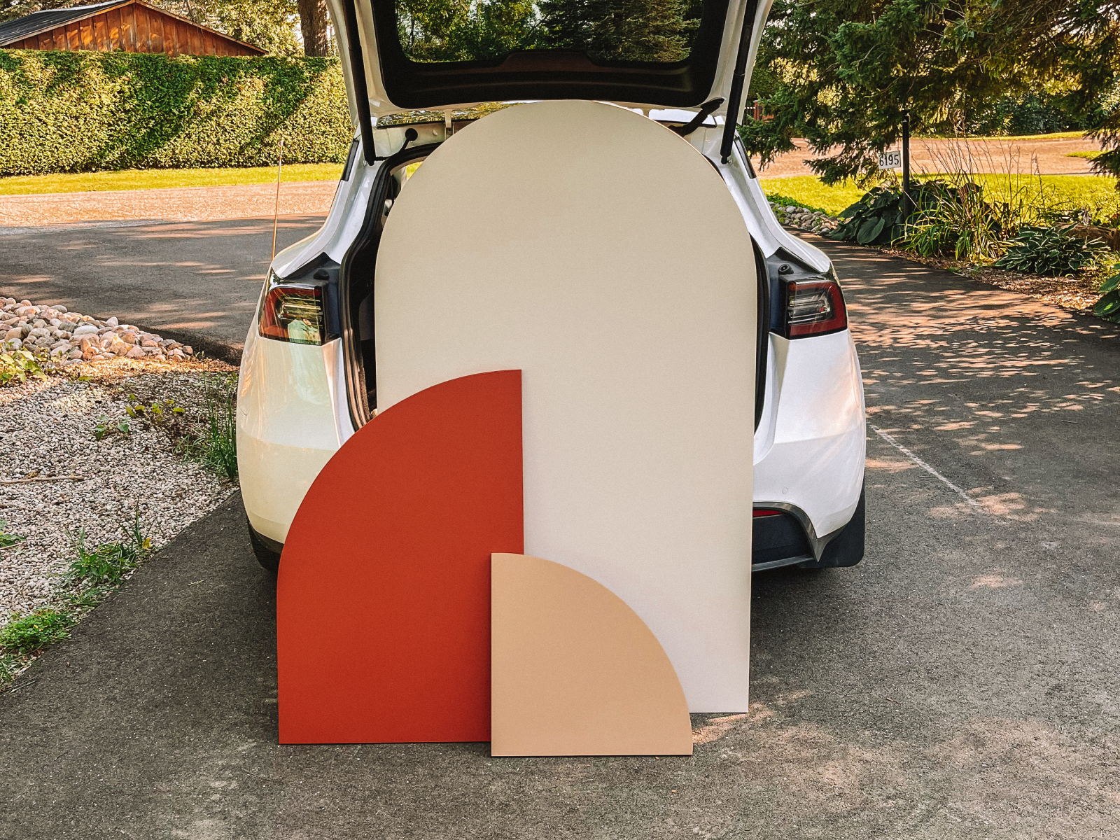
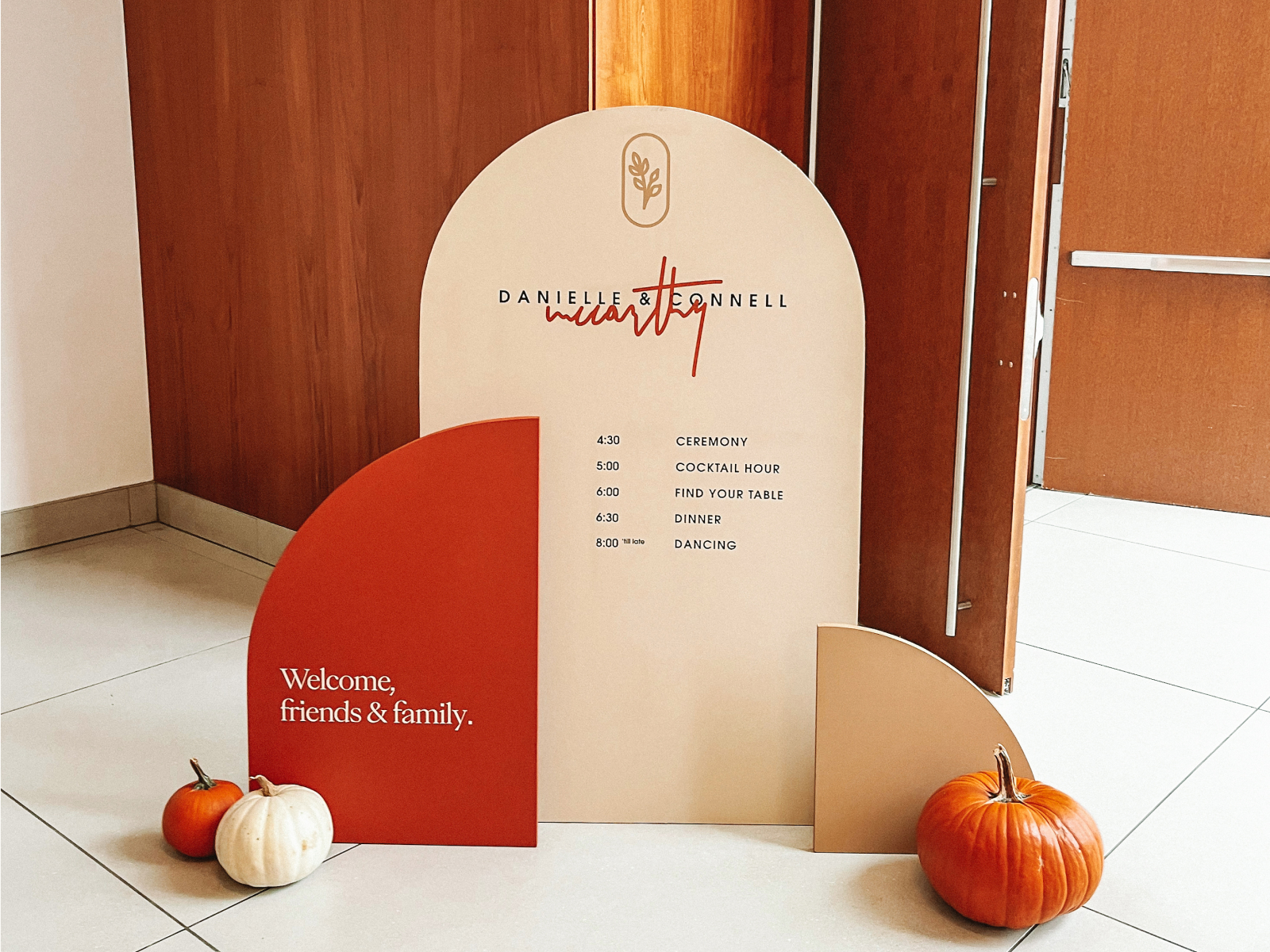
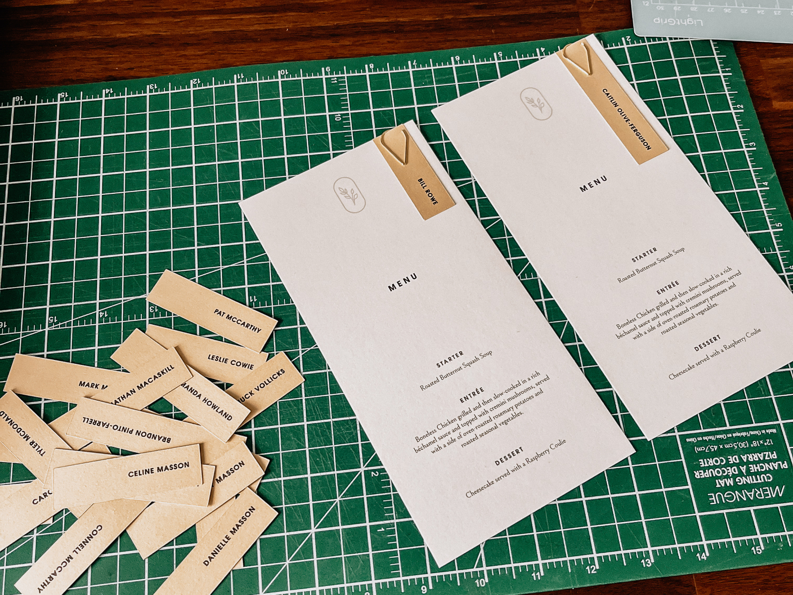
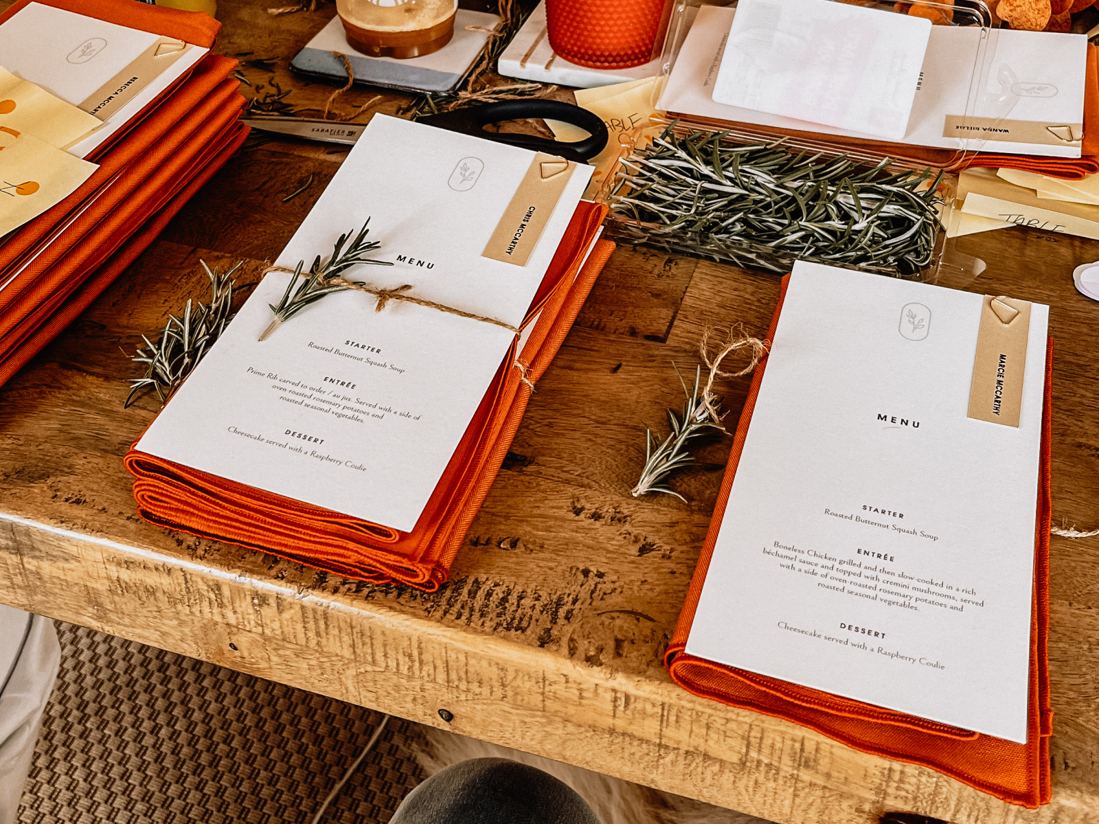
I made a few other small signs out of MDF and vinyl lettering, along with some printed signage for the tables and areas around the wedding venue. I kept the menus clean and minimal using the leftover paper scraps from the RSVP invites.
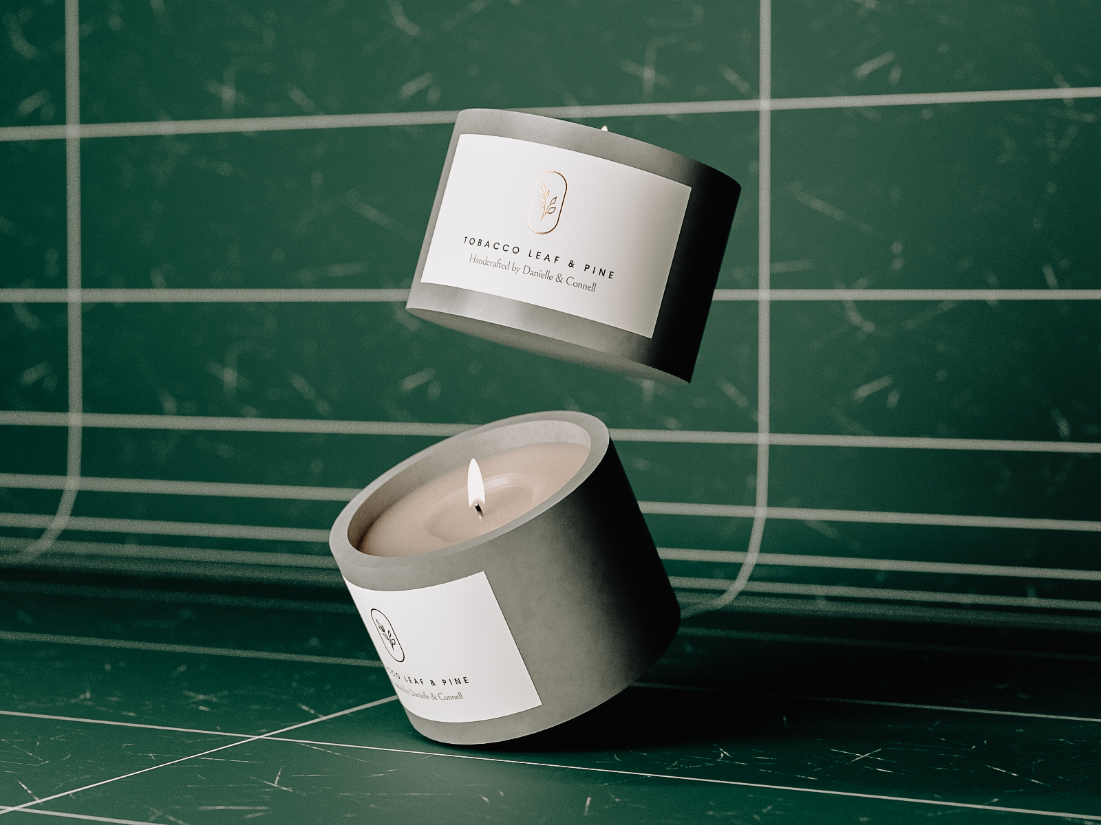
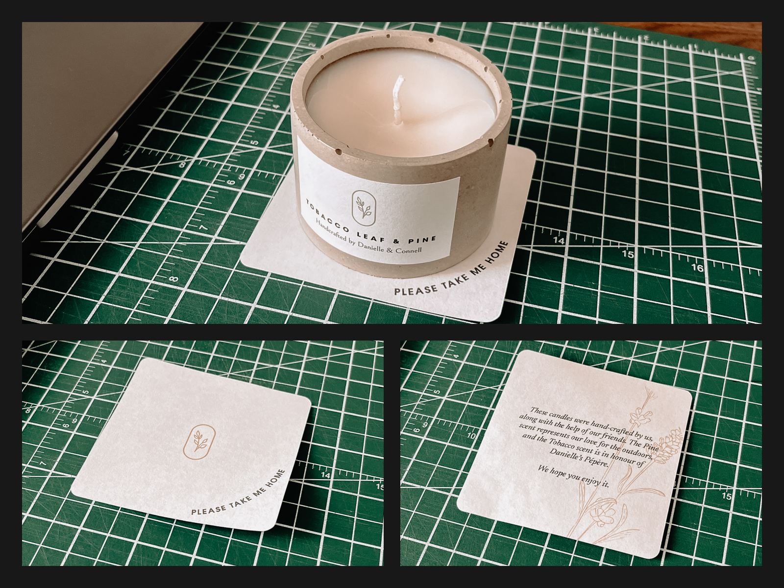
Candles
When we were looking for party favours, we went through so many options that I either thought were too expensive or weren’t reflective of who we are. I came across a cement candle somewhere online and immediately thought that was a great opportunity to hand-make the favours and put a little bit of personality in the gift.
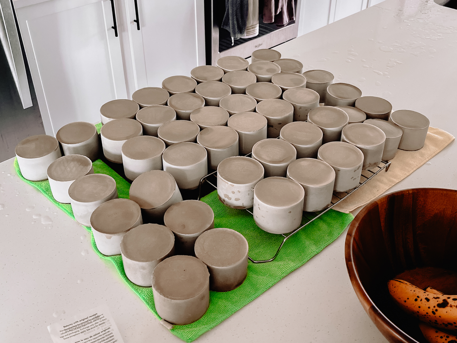
This was a huge undertaking, and if I have any advice for people looking to do the same for yours - don’t.
Each candle holder needed to cure for upwards of 12 hours in the mould, and we needed to make roughly 150 of them. It was a lot of trial and error, learning about the differences between cement and concrete and how the temperature in our garage can affect the setting of the cement. We paused during winter and planned to start the production line in the spring of 2023. We picked up eight moulds, refined our cement process, and kicked it into high gear.
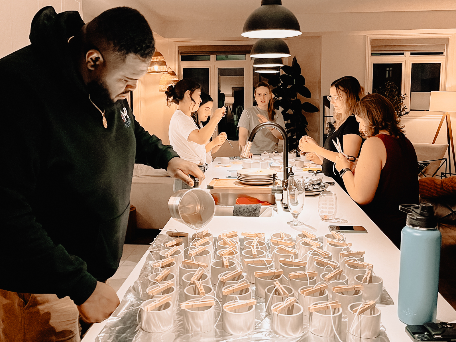
For the scent, we went with a tobacco leaf and pine, which the tobacco was a nod to Dani’s Pépère and the pine to represent our love for the great outdoors. With the help of our friends, we had a candle-making party where we melted and poured wax, stuck labels on the candles, and cut the wicks. We made roughly 125 candles.
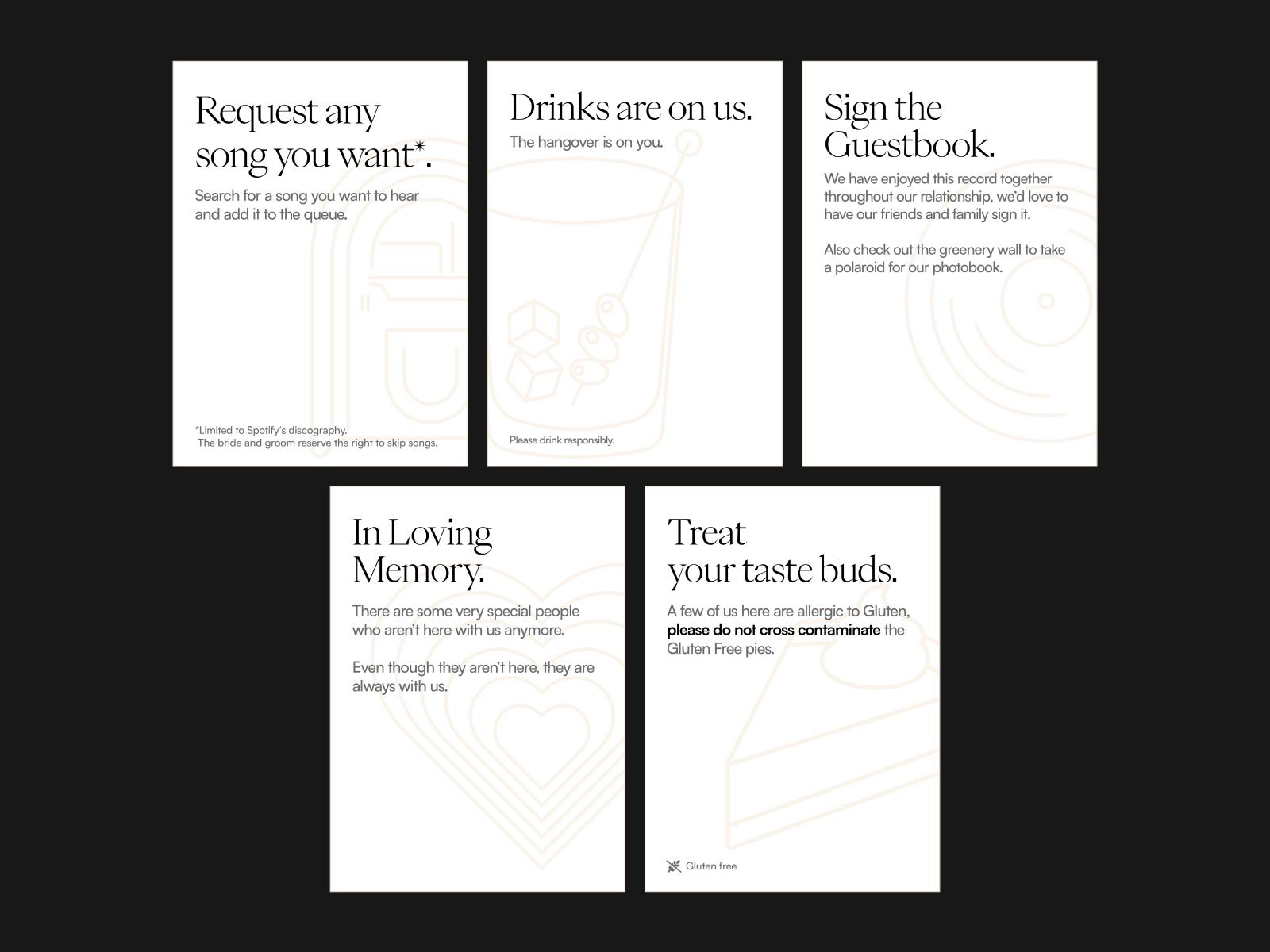
Jukebox
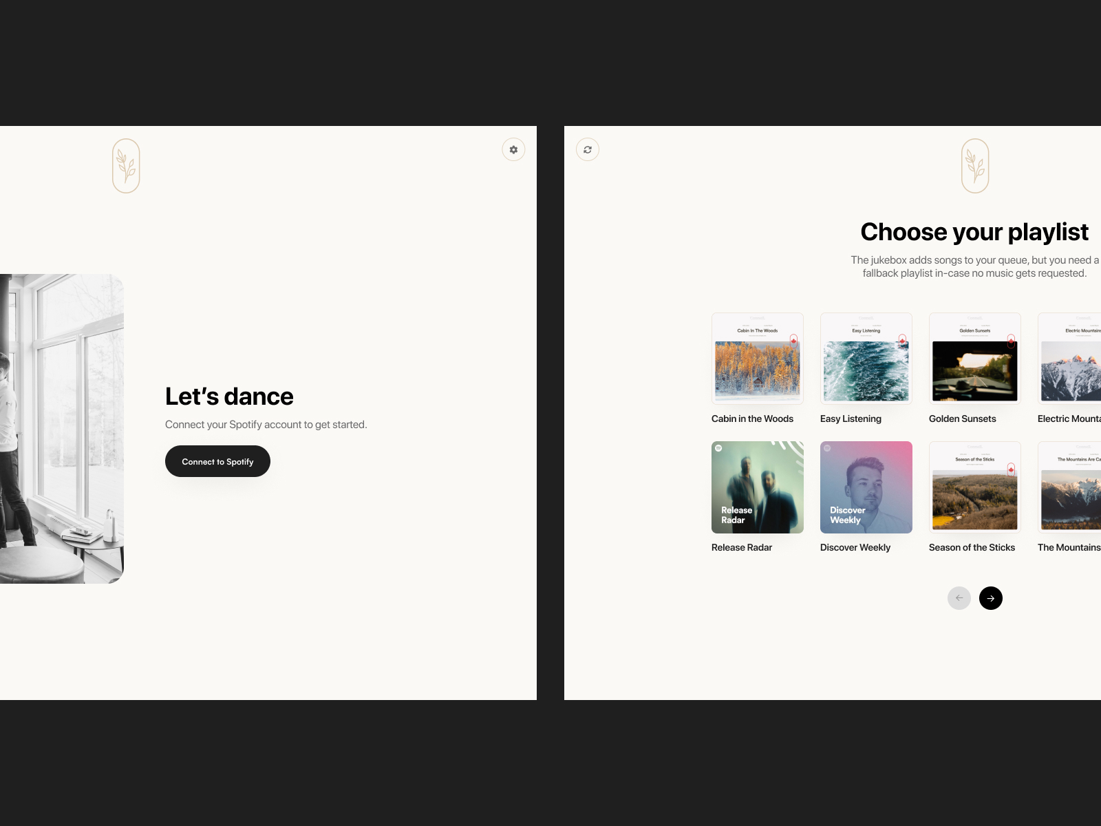
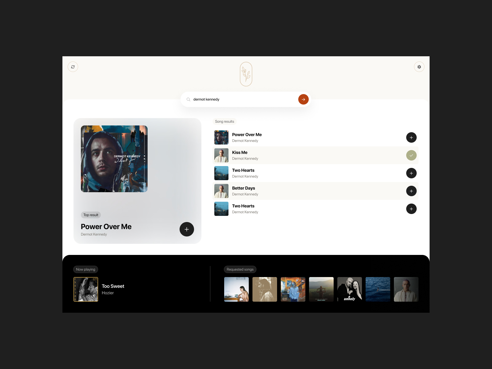
By now, I’m sure you’ve caught on that the theme of the wedding was ‘DIY’. Instead of going with a DJ, we opted to curate and play a playlist through Spotify, but I still wanted the opportunity for guests to request songs. Thinking about how that could work, I realized I could dive into the Spotify API and see if there was an opportunity to build something custom. I found the spotify-web-api-node library, which plugged in nicely to the existing website built in Node.js. With that, I started designing an iPad app experience that worked as a sort of Jukebox. I wanted to keep it super simple, with a top result big and bold and other matches in a smaller list view. The bottom bar would display the current playing song and the songs in the queue.
Essentially, the way it works is that you select a playlist as the source of music to play if there are no requests. If you request a song that exists on the playlist, it will ensure that that song doesn’t play a second time.
The scaffold for the app structure was pretty simple. There’s an authorization route for credentials handling, an onboarding route for playlist selection, a player route to handle the current playing song and the queue display, and a search route for results and queue handling. I added a little database to keep a record of all the requested songs so we could go back and look at all the songs that were played during the night.
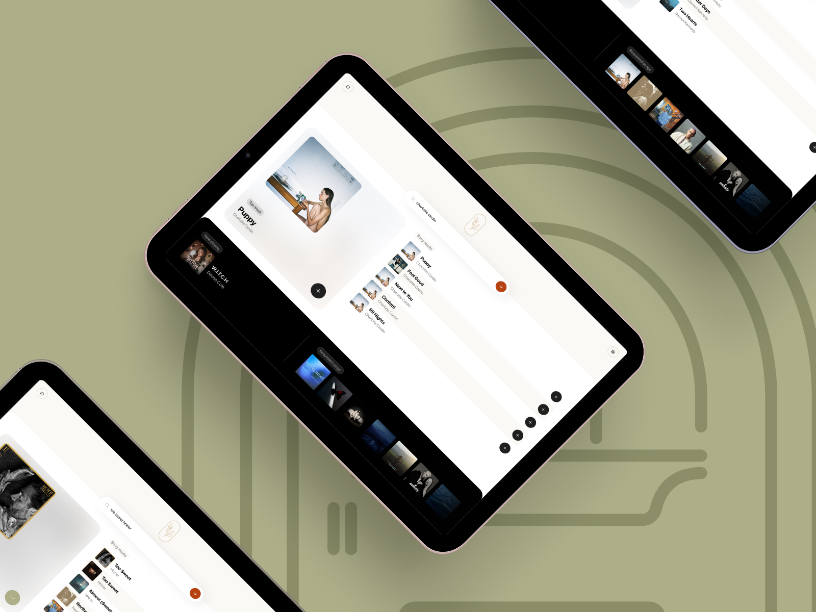
The benefit of using the same framework for the jukebox as the wedding website is that I could give guests the opportunity to start building a playlist of songs before the wedding day. I branded a ‘Get ahead of the jukebox line’ feature, surfaced the module on the homepage and the RSVP details page, and linked to it in emails. It helped us figure out the dance playlist without stressing too much over the songs.
It was a fun little activation at the wedding, and I don’t think there was a moment where the dance floor was empty or the jukebox table didn’t have a little crowd around it. I wish I could say it worked flawlessly, but the venue wifi had a timeout of 15 minutes, so that meant that every 15 minutes, you had to reconnect to the wifi. Note to my future self is to use an iPad with a data plan or tether my phone from the get-go. Beyond that, it was such a fun exercise for me to dive into another app build.
Recap
This was one of the biggest moments of my life, so, of course, I had to use my skills to go above and beyond. I got feedback from so many people about the invitations, the RSVP experience, and the overall night. In the end, some things didn’t go according to plan, but we didn’t even notice until the next day. Being surrounded by the ones we love and those who support us was all we could ask for.